Partly Cloudy
/I'm totally in love with the Pixar short Partly Cloudy. Maybe because I am, admittedly, partly cloudy myself. Or maybe because it is just too damn cute not to like. (Found through Fubiz).
I'm totally in love with the Pixar short Partly Cloudy. Maybe because I am, admittedly, partly cloudy myself. Or maybe because it is just too damn cute not to like. (Found through Fubiz).
Bodies in Urban Spaces is a performance art piece by Austrian artist, Willi Dorner. His crew of dancers and acrobats tour cities, running around as a group, squeezing themselves into whatever gaps or crevasses they pass. Most of the time, the group is wearing dynamically coloured clothes (not in the image above), making themselves into tightly fit, bright, beautiful urban artwork.
My favorite entry into this year's RE:Play Film Festival is Contraction. The short film was written & directed by Christopher Hewitt & James Cambourne. It is totally odd, but there is a simplicity and exaggeration that pulls you in.

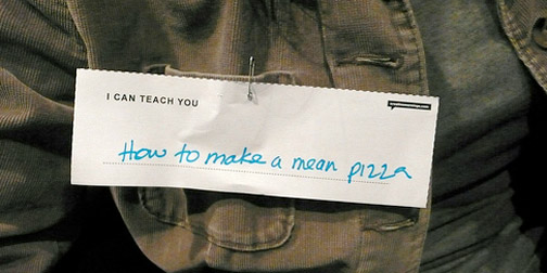
I dread cheesy ice breakers. Bonding through mutual embarrassment is just the wrong way to go about things. That's why I appreciate the brilliance of Swissmiss's technique at recent CreativeMornings. She made name tags, that don't show your name (you always get to that part in conversation anyway), but ask what can I learn from you. Looking through the Flickr set, people has some pretty entertaining skills, making it a great conversation starter.
About once a month I come up with some great reason I should buy a Polaroid camera. This month, I found Polaroid inspiration in the photography of Grant Hamilton. He uses Polaroids to capture colourful geometric patterns. His collection, Geometries, has been building for 3 years, and it is stunning.
Sheena Matheiken is at the beginning of a one year experiment in sustainable fashion. She and a friend have designed a dress that she is going to wear every day for a year (actually there are 7 copies of the same dress, but you get the point). Sheena calls this The Uniform Project. The idea was inspired by many years of having to wear a uniform to school. Working hard to make it unique each day. The money raised from the project is going towards the Akanksha Foundation, which is concerned with education in India.
Follow The Uniform Project website to view pictures of Sheena's daily mastery of accessories. I'm not sure how she manages to put together such interesting outfits. It is making me feel very fashionably uncreative. Sheena also happily accepts accessory donations, or outfit ideas.
Jonn Herschend has curated an exhibit called Sisyphus Office, which pairs Houston artists with office workers to "highlight art as an integral and necessary distraction in our day to day life".
I haven't seen the entire exhibit, but I really enjoyed David Fullarton's contributions. David created a series of small art pieces, made entirely out of office supplies, around the theme "What I do at work when I'm supposed to be working". Some of them are just too good, like the note to the financial department about microwaving halibut, or the apology note (shown above) explaining tardiness.
The exhibit is currently showing in Houston until July 27, 2009.
I went to see Objectified tonight, along with every other designer in Seattle. I enjoyed it. I'm looking forward to seeing it a second time. It had your usual cast of Industrial Design characters, examples, and stories. Jonathan Ive, Karim Rashid, and Marc Newson, all talking like design superstars (unfortunately no Philippe Starck). The IDEO team was talking about toothbrushes and the Smart team was talking about OXO and arthritis. There was a large part of the movie which was, appropriately, ID 101. I'm looking forward to sending my mom to see it. I've spent a good 10 years trying to explain to her, what it is I do. Maybe hearing it from someone else will answer all her questions.
There were a couple parts in the film that I thought were absolutely fabulous. Dieter Rams was his usual brilliant, classy, and fabulous self. I could have listened to him for the whole 2 hours. The second best part to me, unexpectedly, was the contributions of New York Times Magazine writer, Rob Walker. I'm going to have to start reading his column, Consumed, because he said a lot of stuff that really resonated with me.
Go see the movie. It rocks that documentaries about design exist. All designers should go and show their support.
To me, anything you say on Twitter is said in an instant, and if you hear it - you hear it, and if you don't - you don't. I sometimes forget that Twitter is permanent, archived, indexed and searched. Christopher Baker's project, Murmur Study, helps put that into perspective. He has created two installations that print out local tweets on long rolls of paper and drop to the museum floor. Creating an "absurdity of the physical archive" of conversations.
I've seen lots of Twitter visualizations, but none quite as thought provoking as this one. Fantastic idea. (Found through ComputerLove).
Leigh Beisch is a food photographer, with a beautiful personal series called Bodies of Land. The photos are blurry and full of light and colour. They capture an emotion instead of a scene. Like many good photos, they are a glimpse into a much bigger story. In this case, a story that you are mostly free to fill in yourself.

We've all been conditioned to compare ourselves to celebrities anyway, so why not just use that comparison as a unit of measure? Celebrity Scales are bathroom scales where the numbers have been replaced by names of celebrities. The scale was designed by Karl Toomey and is available for purchase at The Celebrity Scale Store. It also comes in different genres of celebrities (music, horror) or different units of measure (animals, cakes, new years resolutions).
Fabian Schlichting has created some photo magic to place German car engineers right into their work. The Autolandschaften photos were taken as a calendar for the research department of a German car manufacturer. The make the researchers look like miniatures, inspecting every little detail of the wheels, airbags, headlights, etc. Fun idea, well executed.

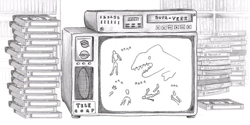
If you don't have time to watch movies, but need to catch up on a few classics, check out 3 Frame Movies. It is a website that summarizes blockbuster greats in 3 simple drawings. The 3 frames try to capture the essence of the movie... as the artist remembers it. Hopefully that means the good parts, but not always. You are all so free to submit your own movie requests.
Some of the interpretations are fantastically amusing. This site is like a mini lesson in storytelling. My favorite 3 Frame Movie is Jurassic Park.
Microsoft's Xbox announced its Project Natal at E3 today. It is the next revolution in gaming and entertainment where no controllers are required. They system uses a camera mounted on your TV to capture full body movement, allowing participants to control and interact with the game using natural movements. They advertise that the only experience you need is life experience. The system also incorporates facial recognition, voice recognition and the ability to scan in your own gear for use in the virtual world. Watch a full video here.
This looks super cool. I can't wait to try it.
I am always in awe of the talent of comic book artists. I was inspired by this behind the scenes look at Hellboy Darkness Calls. It shows the script, sketch, ink, color, and lettering stages of a few pages from the comic.

Earlier this year, idiot er... design student, James Titterton offered his body up as a canvas. He ran a design contest to offer his skin "as a light sensitive material, upon which I am willing to have appropriate visual content 'developed' as a suntan". The winning design was submitted by Finnish graphic designer, Janine Rewell. James documented the stenciling, tanning and exhibition process on his Tan Man blog. Oh dear.
"Dear American Airlines, I (Dustin Curtis) redesigned your website's front page, and I'd like to get your opinion. I’m a user interface designer. I travel sometimes. Recently, I had the horrific displeasure of booking a flight on your website, aa.com. The experience was so bad that I vowed never to fly your airline again. But before we part ways, I have a couple questions and three suggestions for you."
Ha! I admire the thinking and motivation behind Dustin's Dear American Airlines website. Designers 1, American Airlines 0.
I'm a sucker for origami. So I appreciate these beautiful origami-to-be bags. Profits from the purchase of each bag go toward the WWF. Designed by Magdalena Czarnecki.
I just wish this was packaging for something. It's a great idea, but seems like a missed packaging opportunity.
Pick One is an experiment in decision making. Viewers are presented with two (random) words, and asked to pick one of them. Sometimes the decision is easy, and sometimes it is very hard. Behind the scenes, points are given to words that are chosen, creating a very interesting list of the top and bottom 10 words. Pick one was created by Ben Nyberg.