Noun Project

The Noun Project is building a free online collection of downloadable symbols.  Their mission is to collect, organize and add to the highly recognizable  symbols that form the world's visual language.  You can currently browse the symbols and download any of them for free to be used however you want.  The Noun Project is also a Kickstarter project, looking to raise money to improve their website by adding new features such as Search or Collections.  Every pledge of $30 or more gets a customized t-shirt featuring up to 3 noun symbols of your choice.

TV Posters

Designer Albert Exergian, created this absolutely stunning series of TV posters as a personal project.  He uses a minimal, modernist style to illustrate iconic TV shows, old and new.  Exergian does an impressive job of capturing the essence of each show in a couple of simple shapes.  The posters are humorous, smart, visual perfection.  Search for your favorite show, I don't think you will be disappointed.  The series is available through Blanka as A1 prints.

Feltron 2009 Annual Report

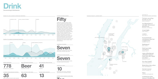
It is one of my favorite times of the year... time for Nicholas Feltron's Annual Report.

Most designers will be well aware of Feltron's tradition, as his reports are an annual source of graphic and information design inspiration.  If you have not heard of them, the Annual Reports are a summary of graphic designer, Nicholas Feltron's year.  They cover the places he has been, the foods he has eaten, the fluctuations in his mood, etc, etc.  They are not only ridiculously pleasant to look at, but amusing to read.  If you are interested in collecting your own annual data, check out one of Feltron's other projects, Daytum.

The Tan Man

Earlier this year, idiot er... design student, James Titterton offered his body up as a canvas. He ran a design contest to offer his skin "as a light sensitive material, upon which I am willing to have appropriate visual content 'developed' as a suntan". The winning design was submitted by Finnish graphic designer, Janine Rewell. James documented the stenciling, tanning and exhibition process on his Tan Man blog. Oh dear.

Dear American Airlines

"Dear American Airlines, I (Dustin Curtis) redesigned your website's front page, and I'd like to get your opinion. I’m a user interface designer. I travel sometimes. Recently, I had the horrific displeasure of booking a flight on your website, aa.com. The experience was so bad that I vowed never to fly your airline again. But before we part ways, I have a couple questions and three suggestions for you."

Ha! I admire the thinking and motivation behind Dustin's Dear American Airlines website. Designers 1, American Airlines 0.

Microsocope

0510-microscope.jpg

Microscope is the self-reflective, senior project of design student, Matt Convente. He uses a series of posters to put himself under a microscope and express his thoughts, fears and desires. The posters have pleasant, simple graphics that enhance the sentiment of the text. Some of the images are direct representation of the thoughts, while others are meant as clarification to the true meaning.

My favorite part about this project is the categories. Matt has arranged his posters in categories of x10, x100, and x1000. The categories are intended to represent the level of magnification, or depth, that the poster reveals about him.

Judge a Book by its Cover

Come on designers, you know you judge a book by its cover.  But just how accurate are you?  Test your skills on Judgeby.com, a website that allows you to guess a book's Amazon rating just by looking at its cover.

I was pretty actuate at this.  Which makes me think one of two things: A well designed cover reflects well on a book OR people who write good books are smart enough to appreciate a well designed cover.  More thoughts? (Found through A Collective Knot).

Slagsmalsklubben

Back to the topic of digital storytelling (a growing obsession of mine).  Swedish design student, Tomas Nilssons has created this smile worthy digital interpretation of Little Red Riding Hood, as part of a school project.  The animation was inspired by the Royksopp Remind Me video, and borrows heavily on the style and format.  Despite the me-too aspect, I greatly enjoyed the twist on the Little Red Riding Hood story.  Another great example of a classic story reinterpreted to a digital story.

51 Japanese Characters

0112-japanesecharacters.jpg

51 Japanese Characters is a collection of characters based on archetypes within Japanese society.  Designer Peter Machat, created the characters while living in Japan.  Each character has a name and insightful description.  Oh, and did I mention the super cute caricatures?  You can purchase a poster or postcard set of all 51 characters on Peter's website.  Even if you are not planning on purchasing anything, take the time to visit the website.  It is done in an impressively stunning, minimalistic style.    (Found through Josh Spear).

ASDA Lunch Boxes

1219-ASDA-lunchbox.jpg

These lunch boxes are a great example of packaging design by Emma Smart.  Each sandwich box opens up into an image of a place setting.  There are three different lunch box themes (Satisfying, Healthy and Children's), each with an appropriate design.  I would be so thrilled if I opened my lunch box to find this.  It shows how much emotional enjoyment design can add to an experience.  Emma created these lunch boxes for ASDA as part of a student project a few years ago.

Listen and Record

Listen and Record Wallpaper is part of Ihas Fotopoulos' Series Two wallpaper collection.  The whole collection was influenced by dots and lines from unexpected sources.  the Listen and Record patterns are based on braille.  They also have a fascinating story associated with them.  The story, by Juro Osawa, is about recording his voice every night before bed and then listening to the recording exactly one year later.  He's been doing the every day for 11 years!  I can't do the story justice, so make sure to look it up on the website yourself.  I'm not entirely sure how the story relates to the wallpaper, but it kind of doesn't matter because the story is so good.

Daytum

Daytum is a site that lets you collect and graph any sort of data you want.  It is currently in private beta, but I can't wait until it goes public.  Users each get their own site to display whatever type of data they are tracking.  The current examples are pleasantly mundane:  The cat's I've seen; The websites I visited this week; The amount of times I used technology this week; Meals I've made for dinner.  The graphic design of the data is fresh and simple.  Just one more example of why I'm changing my opinions about charts and graphs.

History of Crayola Crayons

1017-crayolacolorhistory.jpg

Graphic Designer, Alison Haigh, has created this smile-worthy chart depicting the history of Crayola crayon colours.  It shows how the original colours were added to over time.  The chart has no timeline but you can almost fill in the gaps based on the new colour additions or the colour cuts.  Fantastic representation of some colour history.