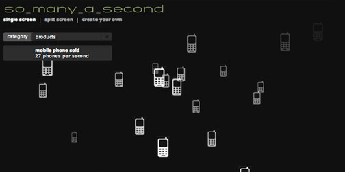
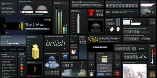
Mapping the Seven Deadly Sins

Geography students from Kansas State University have mapped the Seven Deadly Sins as committed by US residents. The results are pretty interesting, and arguably predictable in many cases. I enjoy that the Greed and Envy maps are so reflective of each other. The sources of the data used to create the spacial distributions is unclear, but an interesting perspective none the less.

Murmur Study

To me, anything you say on Twitter is said in an instant, and if you hear it - you hear it, and if you don't - you don't. I sometimes forget that Twitter is permanent, archived, indexed and searched. Christopher Baker's project, Murmur Study, helps put that into perspective. He has created two installations that print out local tweets on long rolls of paper and drop to the museum floor. Creating an "absurdity of the physical archive" of conversations.

I've seen lots of Twitter visualizations, but none quite as thought provoking as this one. Fantastic idea. (Found through ComputerLove).

Synchronous Objects

Synchronous Objects is a super interesting collaboration between choreographer William Forsythe and Ohio State University's Advanced Computing Center for the Arts and Design.  It is a series of projects is to explore the art of dance from a scientific and data visualization perspective.

One of the sub projects, entitled Cued Annotations, visualizes a dance where each of the dancers starts their part upon a specific cue from one of their fellow dancers.  You can watch the dancers preform the dance from a front or above stage view, and then re-watch the choreography with all the cues and their effects annotated.  The project creators were "interested in the intensity and integrity of the dancers' attention to one another, the rapid exchange of information, and the different qualities of motion in each cue response".   I can't wait to see more

Exactitudes

Ari Versluis and Ellie Uyttenbroek are a German photographer and profiler, who have spent the last 15 years studying the dress codes of social groups.  They have published a book and website featuring their photographs and findings, called Exactitudes (Exact + Attitude).

Members of the same social group are photographed in similar poses.  Juxtaposing their similarity with their desire for individuality.  Providing "an almost scientific, anthropological record of people's attempts to distinguish themselves from others by assuming a group identity".

Wikirank

One of the most interesting things about sites that aggregate data is what they can say about trends over time.  The more popular the site, the more interesting its trend data.  Wikirank is a site that tracks activity on Wikipedia pages over time.  Graphing the results to show changes in page popularity.  Out of the ordinary spikes generally reflect a news worthy event.  The site also allows for a number of pages to be compared for more long term data.  The image above shows the popularity of each of the Beatles' members.  Clearly John is the most interesting (to Wikipedia readers).

We Tell Stories

We Tell Stories is a website created by Six to Start for Penguin books. It features 6 writers, telling 6 stories, in 6 weeks. The project takes classic Penguin titles and retells the stories in a digital format - but not your typical, eBook style digital format.  Six to Start consider themselves modern storytellers who tell stories using high tech interactive methods and media.  Of the 6 stories, one is told using areal view map fly overs, one is told using twitter, two are web based choose your own adventure stories, another was written in real time with real time readers, and yet another was interpreted by Nicholas Felton's data driven infographic style.

Whew.  And I'm sure there is much more to come.  The world of digital and location based storytelling is just beginning.  (Found through Half Deserted Streets).

How Benjamin Button got his Face

I really enjoyed the movie The Curious Case of Benjamin Button.  Particularly because I was so enthralled by the special effects used to make the actors look younger and older.  They were amazingly well done.  I just watched Ed Ulbrich's TED talk about how Digital Domain created Benjamin's face, and now I'm even more impressed.  His head is computer generated for the first hour of the film.  The process that they created to make the effects realistic is pretty incredible.  They innovated by using "technology stew" - combining little bits of relevant technology gems from gaming and medical imaging.  I recommend listening to the explanation.  They had me at phosphorescent makeup...

Synoptic

I'm always looking for new inspiration to feed my information visualization addiction.  Today I found that inspiration in Synoptic.  Synoptic was created by German design student Roland LoBlein.  It visualizes meteorological data specified by the viewer, and arranged chronologically.  The visualizations are beautiful, but what really got me was the ability to turn the graph around in 3D. It immediately gives the data more life and relevance. OK, I'm going to say it again - Damn, I thought I hated charts.  (Found through Computerlove).

The Breathing Pot

The Breathing Pot uses your emotional connection to living things to help remind you to water your plants.  We all know that plants are living organisms, but sometimes we forget to treat them that way (guilty).  Designer Jae-Han Song visualized life in a plant by creating a pot that appears to breath.  The small subtle motion of breathing reminds you that the plant is alive.  When the breathing stops, it's time to water!

The Photographic Dictionary

0106-picturedictionary.jpg

The Photographic Dictionary defines words using photographs to accompany words.  They are not your everyday A is for Apple type of dictionary photographs.  The meaning of the word is photographically described through literal, figurative or personal interpretations.  The photographs manage to give some emotion to the definitions.  Definitions of everyday words like "lonely" or "home" are so beautifully enhanced by a descriptive photograph.  I'm inspired to start my own personal version.

Plug into Now

1110-now.jpg

I generally browse the web on high speed.  Sprint's Now Network Widget made me stop in my browsing tracks and pause in one place for a few minutes.  The widget displays all sorts of semi-useless, but incredibly interesting information about what is happening around the world and the web right now.  Displayed info includes tons of eggs being produced, the top word being used online, number of calls being made to 911, and much more.  I'm still watching the numbers tick...

Everymoment Now

Everymoment Now is an info-graphic comparing mentions of American presidential nominees Obama and McCain in the news.  It provides an interesting glanceable history of the election talk over the past few months.  Drilling down to either nominee shows a more detailed view of the references.  Check back in on Everymoment Now after the election to see their next project. (Found through the always fabulous Swissmiss).