Microsoft's Project Natal

Microsoft's Xbox announced its Project Natal at E3 today. It is the next revolution in gaming and entertainment where no controllers are required. They system uses a camera mounted on your TV to capture full body movement, allowing participants to control and interact with the game using natural movements. They advertise that the only experience you need is life experience. The system also incorporates facial recognition, voice recognition and the ability to scan in your own gear for use in the virtual world. Watch a full video here.

This looks super cool. I can't wait to try it.

Interactive Subway Installation

1217-subwaytouch.jpg

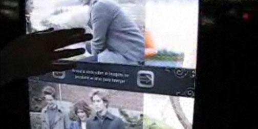
Ginga Interactive in Brazil has been working hard to promote the movie Twilight.  One of their advertising approaches has been a series of interactive posters in Sao Paulo subway stations.  The posters are touchable, allowing subway passengers to explore the content.  They can watch and control clips from the film, browse character profiles and download information to their mobile phones.  Watch a video of the interactive posters here.

1973 ABC.com

1009-abc.jpg

If you went to ABC.com yesterday you were temporarily faced with this mock 1973 version of their website.  The network used the homepage to promote the premiere of their new show Life On Mars, a British series about a modern day cop who finds himself in 1973.  Although I was momentarily freaked out by the homepage, it's nice to see some oldschool UI.  It reminds me of how far software has come.

SenseSurface

0716-SenseSurface.jpg

I'm always looking for great examples of hardware and software coming together.  SenseSurface got me very excited.  It is real physical turn dials being applied to laptop screens to control software. The knobs are magnetic and promise to be gentle on your screens.  The sensing knobs have a custom designed  movement sensor to determine position within approx 180 degrees with a 10 bit digital output, linearity typically 1%.  Designed by Lyndsay Williams.

D/A Clock

0320-da_clock.jpg

I've seen Alvin Aronson's D/A Clock a few times.  I thought it was a sleek, modern take on a digital clock, but I didn't really get the idea that it was a digital/analogue clock until I watched this YouTube video of the clock in action.  The lit numbers of a digital clock have been replaced by a physical representation of the numbers.  Each minute transforms into the next to show a more ongoing view of time, much the same way an analogue clock does. (Thanks Jason!)

Publicis & Hal Riney Website

I've been playing around with the Publicis & Hal Riney website. They have provided the option of navigating the website through gestures picked up by your webcam. I've seen this idea demoed before, but I've never just come across it on a website. I have to admit, the first time I tried this, it wasn't working for me at all. My interpretation of the gestures was a bit too exaggerated (or their interpretation wasn't exaggerated enough). Once I figured it out, I was really enjoying the interaction experience. The novelty of the physical action (beyond my finger on the mouse) kind of snapped me out of my normal internet browsing glaze and made me pay much more attention to the content. It also kept my interest and made me explore much more of the site then I might have otherwise.

ClothTAG

0108-RFID_cloth_tag.jpg

Laundry instruction icons seem to be from a time before it was important to make icons easily understandable.  I can never remember what the triangle means vs the circle.  I always have to look them up - and I consider laundry one of my more developed domestic skills.  One solution to this problem would be to just make better icons.  Or... go the high tech route, like designer Samgmin Bae, and break out the RFIDs.  Samgmin's ClothTAG concept uses the idea that laundry labels could have an RFID element that would be readable by washing machines and driers.  Young domestic goddesses like myself (ha!) wouldn't have to know anything about laundry, the machines would be able to make appropriate adjustments.  This isn't a completely new idea, but it's a more well executed concept then some of the others I've seen.  (Found through Yanko Design).

Burst Labs

1206-burstlabs2.jpg

Burst Labs is the online production music library of The Burst Collective.  The site takes a refreshing approach to organizing and searching through audio files.  I particularly like the Discover feature that allows you to pick from suggested descriptive words to help define the type of music you are interested in.  It gives you just the right amount of tools to 'discover' the music with, depending on your level of adventurism or need to define.

BookScape

1204-Bookscape.jpg

BookScape is an interesting concept for a online library archive.  It was created by Michael Chang of Yahoo's Design Innovation Team.  The project focuses on creating an interface that allows access to digital versions of 2600 illustrated children's books. Images of the scanned books are arranged alphabetically.  Dynamic resampling is used to efficiently show all the images at once in one zoomable space.  Zooming out allows quick navigation of the entire collection.  Zooming in gives you more finite navigation control.  This project reminds me a bit of some of the thinking behind Microsoft's amazing Photosynth that I wrote about earlier this year.

American Airlines Remembers Me

1106-aa-rememberme.jpg

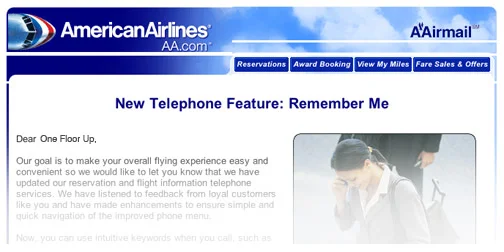
Oh thanks goodness, someone is still thinking about automated telephone interfaces!  I just got an email from American Airlines informing me that from now (pending some action on my part) they will recognize me when I call.  If you are an American Airlines Advantage (reward card) holder you can now register your cell phone number with your account and when you call from that number they will recognize your number pull up your details without you having to enter account numbers, etc.  If you call within 23 hours of a scheduled flight they will automatically provide you with details specific to your departure.  And here I was thinking that my parents were the last people to get caller ID!

PowerCurser

1101-interface.jpg

PowerCurser is an free downloadable Flash Toolkit that allows you to create touchable interfaces.  It simulates stickiness, volume, pressure and roughness.  What is interesting about it is that it doesn't use any sort of physical feedback. Their approach is to use graphics and alter the way the curser responds to create the illusion of touch.  Essentially, your brain is doing all the work by taking in the visual stimuli, filling in the gaps, and creating the perception of touch.

Belkin N1 Vision

1018-N1-Vision.jpg

I found myself in Best Buy a few weeks ago staring at the Belkin N1 Vision and daydreaming about how I could sabotage my own wireless router to justify buying this one.  My desire was not without reason.  This router has a lot of great features including CD-less installation and a vertical orientation to reduce its footprint on your desk/floor/whatever.  The really big improvement that they have made over other routers is adding a screen.  The display shows all sorts of useful information such as upload and download speeds, current wireless users connected, and activity over the past 24 hours.  This makes the router an valuable part of your internet setup and not just a box with blinking lights under your desk.

Eric Johnson, meet World

0925-Sixty_Switches_of_Fury.jpg

World, meet Industrial Designer and digital music artist extraordinaire, Eric Johnson.    Eric just debuted  two of his most recent musical experiments at Etsy Labs Handmade Music nights.  The first was  his very entertaining Theremin Crutches.    He recycled an old pair of crutches into a large theremin.  The result looks and sounds like someone releasing all the stress the crutches have collected.  Love it!

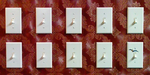
Eric's other project, Sixty Switches of Fury, is even more fabulous.  It's a controller made to look like a piece of suburbia.  The large section of wall houses 60 (now 61) light switches each controlling a music sample.  The switches are arranged in octives like a keyboard, but unlike a keyboard you don't have to hold the keys down.  Instead you just turn the switches on or off, creating a more natural and useful interface for those of us with only 10 fingers.

I appreciate Eric's approach to musical instruments because he comes at it from a design background and not just a musical one.  The end result is all about the user interface and the interactive experience.  The fabulously entertaining music is just a bonus.  Eric's work was recently been featured by Wired and Time Out New York.  May I just say that Nerdsters are awesome!

Pet Shop Boys Integral Video

1008-psb-integral.jpg

The Pet Shop Boys worked with creative group The Rumpus Room to create the latest version of their Integral video.  The song was written as a type of protest against ID cards in the UK.  There are two really interesting things about this video.  The first is that they are using 2D barcodes (or QR codes) to provide additional information.  The barcodes can be read by enabled cellphones.  Each QR code in the video contains a URL linking to relevant information.  To download a QR code reader for your phone or to create one for your own URL, visit Kaywa.

The second really interesting thing about this video is that the Pet Shop Boys are encouraging people to make their own version of the Integral video.  They have provided all the stop frames in a 1451 page downloadable pdf, as well as created a group on Youtube to post your video edit to.

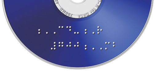
Braille CD-R

0905-Braille_CD.jpg

The fact that CDs and DVDs are the same shape and size comes in handy for a lot of reasons, but isn't quite so helpful if you are visually impaired. Mitsubishi Japan has released a line of recordable CDs and DVDs with braille labeling.  Good idea and a great reminder to all designers about the importance of physical differentiators.  I'm not visually impaired, but I'd love to be able to tell the difference between a CD and DVD without reading the fine print.  (Found through Cool Hunting).

Filippa Smedhagen Sund

0905-filippasmedhagensund.jpg

I like the portfolio of Swedish Makeup Artist Filippa Smedhagen Sund.  It contains some gorgeous photography of her work.  What I like most about the site is the interface.  Upon entering the site you get quick instructions on how to navigate, and then off you go.  The interface is simple enough that you could probably figure it out yourself but I like the courteous idea of just showing people what to do up front.  It makes users much more receptive to new interface styles.  The site was designed by the Berlin based company, Mocoro.