Lekki

If you are one of the many people embracing the back to basics trend or just don't require the anything above a feature phone, consider Lekki.  Lekki is a company that is giving a new life to old school cell phones.  They are selling retro cell phones (yeah, I actually said retro cell phones - feel old now) with fresh paint jobs, turning them into modern fashion statements.  Their line currently includes two favorites from the 90's the Motorola StarTAC and the Nokia 3210.

Beehaus

Omlet, the designers behind the Eglu, are now taking on the world of bees. The Beehaus is a product designed to raise bees in your back yard or rooftop. Because as they say, bees in your garden, honey on your toast! The Beehaus holds 24 frames, enough for two colonies. It is designed to keep both you and your bees comfortable. It provides solid insulation to keep the bees warm, and a raised design for a suitable working height for you.

Looks like a great learning experience. Let's just hope your neighbours also love honey more then they hate bees.

Chocolate Mail

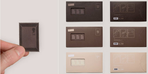
I'm constantly horrified at the idea of having to lick stamps or envelopes. They taste terrible. There is no need for this (as this week I discovered you can buy mint flavored fake blood - if they can make fake blood taste good, surely they can make stamps taste good). Enter the brilliant design mind of Toby Ng. Toby has created Chocolate Mail. It is a conceptual project about redesigning stamps to taste like chocolate. The chocolate stamps would come in 3 different flavors, dark, milk or white, and would be sold in sets of 24 resembling a chocolate bar.

Design makes me happy.

Hello Haptic

Hello Haptic is a set of tactile flash cards. The cards are designed to teach blind children about the diversity of nature. One side of the card has a braille description of the environment, and the other side is a 3D, tactile representation. The cards are arranged by subject; Forest, Beach, and Zoo. Hello Haptic was designed by Hongik University, Industrial Design student Rhea Jeong. The project won her a Silver award in this year's IDEA competition.

Objectified

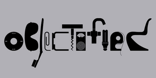
I went to see Objectified tonight, along with every other designer in Seattle. I enjoyed it. I'm looking forward to seeing it a second time. It had your usual cast of Industrial Design characters, examples, and stories. Jonathan Ive, Karim Rashid, and Marc Newson, all talking like design superstars (unfortunately no Philippe Starck). The IDEO team was talking about toothbrushes and the Smart team was talking about OXO and arthritis. There was a large part of the movie which was, appropriately, ID 101. I'm looking forward to sending my mom to see it. I've spent a good 10 years trying to explain to her, what it is I do. Maybe hearing it from someone else will answer all her questions.

There were a couple parts in the film that I thought were absolutely fabulous. Dieter Rams was his usual brilliant, classy, and fabulous self. I could have listened to him for the whole 2 hours. The second best part to me, unexpectedly, was the contributions of New York Times Magazine writer, Rob Walker. I'm going to have to start reading his column, Consumed, because he said a lot of stuff that really resonated with me.

Go see the movie. It rocks that documentaries about design exist. All designers should go and show their support.

Celebrity Scales

We've all been conditioned to compare ourselves to celebrities anyway, so why not just use that comparison as a unit of measure? Celebrity Scales are bathroom scales where the numbers have been replaced by names of celebrities. The scale was designed by Karl Toomey and is available for purchase at The Celebrity Scale Store. It also comes in different genres of celebrities (music, horror) or different units of measure (animals, cakes, new years resolutions).

Best Made Company Axes

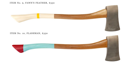
It is amazing what a little bit of design can do, even if the only added value is aesthetic. Best Made Company has added just a touch of design to a very classic object, an axe. They manufacture a range of axes with painted handles. Each colored handle is given a clever name to compliment nice design with good branding. The designs are released seasonally, like fashion lines.

If none of this season's axes appeal to you, you can always request a custom, ideal, design. Design and branding doesn't come cheap (thank goodness it adds value), axes range from $235-$550. Brilliant. I'm not sure how this is going over with the lumberjack community, but the design community is drooling.

If you visit the website, be sure the check out the inspiration page. It's raw, honest, and fantastic.

Shelter in a Cart

1015-shelterincart.jpg

For those who have little or no money in our society, homelessness is a big issue.  Is there a place where design can help the homeless?  Designboom hopes that there is.  They sponsored this non-profit design competition called Shelter in a Cart.  In all, 4247 designers from 95 countries contributed design ideas.  Although the competition itself was judged as being a superficial approach to solving poverty and homelessness, I have a hard time considering that many people thinking deeply about homelessness a superficial activity.  Judge the results for yourself.

One of my favorite contributions was this Tent Cart by Timo Niskanen of Finland.  His design was also nominated for a 2007 Index Award.  Hopefully you too will be inspired to work on non-profit designs.

Heklucht Bikestand + Pump

0915-bikestand.jpg

The Heklucht Bikestand is a place to lock up your bike combined with a bike pump to add air to your tires.  The idea came out of a neighborhood revitalization project in Ypenburg, The Netherlands.  The project's aim was to bring neighbors together in an interactive way.  The bike stand itself has a nice utilitarian functionality to it.  Putting the bike stand in front of houses creates an interesting but unnecessary element to the design story.

Touch Sight

Touch Sight is the first camera designed specifically for the visually impaired.  It is a concept created by Chueh Lee and the Samsung China team.  The camera is held against the photographer's head for stability.  It records the image along with 3 seconds of audio to be used as a title.  The image is then displayed on a flexible braille surface for the photographer to touch.  Inspiring idea.

Slingbox

0813-slingbox.jpg

I've been meaning to buy a Slingbox for a while but just never got around to it.  I finally got a chance to try one out this week... and it's amazing. If you don't know what a Slingbox is, basically it is a set top box that allows you to watch your home TV (DVR, DVD, satellite or any other video output device(s)) from your computer or mobile phone via the internet.  It uses your home network to broadcast the signal.  You can not only watch your TV, or other devices, but control them remotely.

Sling Media has been around for a few years now.  They have won a bunch of awards including a few industrial design awards a couple years back.

I've been using my Slingbox on my laptop, both around the house and remotely, as well as on my Moto Q phone.  The video streaming is fantastic.  There is just a little bit of lag and pixelation... all very forgivable.  The Slingbox Solo (connects to one device) costs about $150 with no subscription fees and HD support.  They also make a Slingbox Pro which allows you to connect to up to 4 devices.  Very impressive.

Otto

0810-otto.jpg

According to designer Duncan Wilson, "Every object and surface in our environment has a whisper; subtle tremors and vibrations that are usually undetectable to the human ear, produced by the activity and movement of daily life."  He developed Otto to give you a glimpse into those secret whispers of objects. Otto uses suction cups and magnets to latch onto objects and amplify their sounds into ambient music for your listening pleasure.

Wilton Rolling Pin

0721-wilton.jpg

Rolling pins have looked and worked the same for decades.  Wilton has finally successfully redesigned the rolling pin by addressing their one major flaw - they  are hard to clean.  The Wilton Rolling Pin has detachable handles, allowing it to be fully submersible in water and dishwasher safe.  This is a major design victory on behalf of us lazy bakers.  Design work by A2 Inc. Winner of an IDEA Bronze award.

Outdoor Cutlery

0528-cutlery.jpg

Anafim is a set of outdoor cutlery designed by d-Vision, an industrial design internship program.  I don't think this cutlery is totally necessary.  I don't see the difference is between carrying around half a fork or a whole fork.  However... I still really like this idea.  Not from a utility point of view, but from an experience point of view.  I would enjoy using this cutlery.  It has a fun natural and artistic feel to it. You could find just the right stick handle for your eating preferences.  It also has the satisfying underlaying reference of making tools out of things in nature but with a modern twist where you don't have to sharpen your own blade.  (Found through MoCo Loco).