Colour of Music

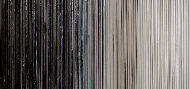
George Benson is just finishing an exhibit as part of the West Midlands Open 2010 at the Birmingham Art Gallery & Museum.  The series shown was called Colour of Music.  The photographs in the series feature collections of records arranged by colour instead of genre.  The effect is quite beautiful.  In the words of the photographic artist:

"The photographs create a rhythm of colour, light and shade that resonates with its musical content."

Hue Test

0512-huetest.jpg

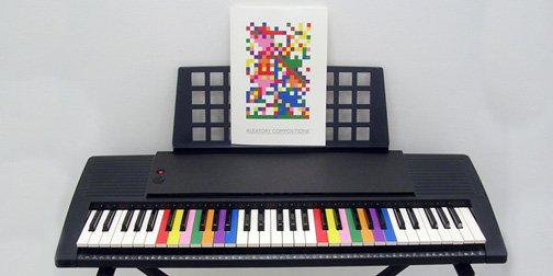
How is your sense of hue? Test your hue definition skills with this online version of the Farnsworth-Munsell 100 Hue Test. Rearrange the colors in a progressive gradient to test your ability to see small variations in color. If you want an accurate measure of your color definition skills, be sure to take the authentic physical test, this online one is just for fun.

Color of the Internet

Antrepo4.com tried to answer the (hardly age old) question of what is the color of the internet?  Although this problem could be approached in many ways, they chose to look at it from the scaled perspective of the top ranked sites.  They created 4 posters showing the colors for the top sites in the categories of Global, Design, Games and Blogs.  Then surfacing the most dominant color in any category.  No surprise that the Global website color was blue (safe, predictable and unoffensive - yawn). Visit their website to see the full range of colors and order one of the beautiful color posters.  I'd love to see this done over time.

AutoKratz's Stay the Same Video

0106-partizan.jpg

I have been admiring the artistic use of infographics in the AutoKratz Stay the Same video.  It was directed by Laurie Thinot of Partizan Labs.  The storyline is a little strange, but animation and flow are noteworthy.  I was especially taken by the color pallet used.  The dark, rich colors accentuate the illustrations and the old school projector effect.  (Found through Motionographer).

Multicolr Search Lab

There are many different ways to search photos, one of the more useful ones is by using colour.  Multicolr searches 10 million Creative Commons Flickr images, using colour as its search parameters.  The process is powered by Idee's visual similarity search, Piximilar.  It allows users to specify between one and ten colours to search. The results link directly to the photo's Flickr site, providing easy access to the images.

History of Crayola Crayons

1017-crayolacolorhistory.jpg

Graphic Designer, Alison Haigh, has created this smile-worthy chart depicting the history of Crayola crayon colours.  It shows how the original colours were added to over time.  The chart has no timeline but you can almost fill in the gaps based on the new colour additions or the colour cuts.  Fantastic representation of some colour history.

Colors of NYC

0514-ColorsOfNYC.jpg

For awhile my life was split between Fort Lauderdale, Florida and New York City.  Going back and forth, I was always struck by the color difference between the two cities, especially in the winter months.  Florida was lush and green with with sunny pastel accents and New York was colorful but in a gritty and raw kind of way.  Julie Cloutier of Facing Desks had captured some of the colors of NYC in this great NY Color swatch book.

Sound of Color

0226-soundofcolor.jpg

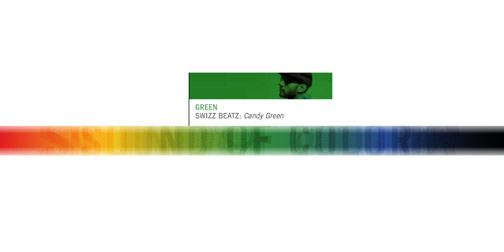
The Sound of Color challenged 5 musicians (Dntel, Marie Digby, Swizz Beatz, The Blakes, and The Raveonettes) to write a song composed around a color.  Then they passed on the tracks to 5 directors to turn into music videos.  The result is not exactly what I would have expected, but that unpredictability is part of what makes this project interesting.  You can watch the music videos, download the songs, and get some insight into the thinking behind each color interpretation at soundofcolor.com.

My Cuppa

0905-My_Cuppa.jpg

These My Cuppa mugs have been featured on a lot of blogs lately, but they are such a good idea that I had to write about them myself.  Designed by Suck UK, these mugs were created to help you make the perfect cup of tea or coffee.  They have a little color matching guide on the side to help you add just the right amount of milk.  This is perfect if you are into experimenting with milk, and even more perfect if you are trying to instruct someone on how to make your tea/coffee.  'Make it a Builder's Brew would ya luv'.  Available for purchase on the Suck UK website.

Colour of Birds

0730-Colour_of_Birds.jpg

Colourlovers is a website, much like Adobe Kruler, that allows users to create 5 colour pallets which can be imported into Illustrator (or other image creation software).  They also have a blog, which is fabulous.  One of my favorite parts of the blog is when they feature the colours of... something.  For example the colours of birds or the colours of famous paintings.  I love colour but I'm not very good at creating colour schemes, so these are great inspiration.

Moody

0514-Moody.jpg

I was playing around today with an app called Moody by Crayon Room.  It is an iTunes add on that allows you to tag songs based on emotional criteria.  Songs are tagged using a colored grid to indicate how happy or sad, calm or intense your find them.  Songs can then be played back using one, or multiple mood tags, essentially creating a mood specific playlist. 

I like this idea because I do listen to different music depending on what mood I'm in, but I wish there was a more automated way to create the tags.  I appreciate that adding the tags yourself makes them personalized (as in, a song that makes me happy could make another person sad), but I don't have time to tag all 2500 songs in my library.  It would be better if songs were automatically tagged based on variables such as song speed, genera, etc, and then I could go back and adjust them later.

I was also really intrigued by the idea of using colors to represent moods, as opposed to smiley faces or some other method.  It takes a little while to get your head around which colors represent which moods, but I think it works. (Thanks James!)