Analogue Tweets

As part of his W+K's Platform application, Marcelo Pena Costa started an Analogue Twitter account. He set up a webcam while working on his project and wrote tweets live with a marker on paper, pinned to a bulletin board.

In my opinion, Analogue Tweets is actually a way more interesting idea than the project it was designed to document (I [heart] wires). This idea is so brillant, I'm filing it under Damn-I-wish-I-had-thought-of-that.

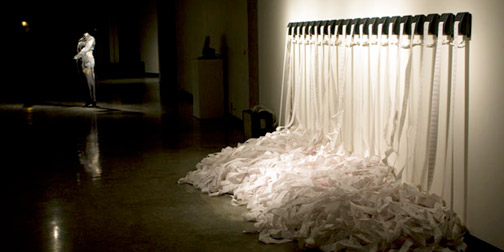
Murmur Study

To me, anything you say on Twitter is said in an instant, and if you hear it - you hear it, and if you don't - you don't. I sometimes forget that Twitter is permanent, archived, indexed and searched. Christopher Baker's project, Murmur Study, helps put that into perspective. He has created two installations that print out local tweets on long rolls of paper and drop to the museum floor. Creating an "absurdity of the physical archive" of conversations.

I've seen lots of Twitter visualizations, but none quite as thought provoking as this one. Fantastic idea. (Found through ComputerLove).

The Museum of Broken Relationships

0427-museumofbrokenrelations.jpg

When a relationship comes to an end, what do you do with all of the objects associated with that relationship? You know... the objects that have expired sentimental value attached to them? Sure you could take the fantastically therapeutic and non-environmentally friendly approach of ceremoniously burning them or throw them away as some sort of hazardous waste bag. Or... you could contribute them to the Museum of Broken Relationships.

The Museum of Broken Relationships is both a physical and virtual museum which promises to help an individual get rid of "controversial objects" that trigger "undesirable" emotions. It turns your objects from past relationships into a museum pieces, thereby "preserveing the collective emotional history". All contributions to the exhibit are submitted with info about the length of the relationship and story behind the object.

Slagsmalsklubben

Back to the topic of digital storytelling (a growing obsession of mine).  Swedish design student, Tomas Nilssons has created this smile worthy digital interpretation of Little Red Riding Hood, as part of a school project.  The animation was inspired by the Royksopp Remind Me video, and borrows heavily on the style and format.  Despite the me-too aspect, I greatly enjoyed the twist on the Little Red Riding Hood story.  Another great example of a classic story reinterpreted to a digital story.