Dr. Horrible's Sing Along Blog

For some holiday Monday fun, check out Dr. Horrible's Sing Along Blog. It is a short musical by Joss Whedon which was created last year as an internet only release. It stars Neil Patrick Harris as a video blogging super hero named Dr. Horrible... (could you ask for a more amazing premise for a musical). If you watch it I guarantee you will wake up singing "With my freeze ray I will stop the world".

BBC Blast Studio

0515-blaststudio-02.jpg

The BBC currently have a great website up that allows you to play with interactive art in their studios. The BBC Blast Studios connects you to a live stream of the BBC studio (available 12pm-12am) where they have 3 interactive art pieces. Online users can choose an art piece to play with and then follow the instructions to participate.

My favorite is Mark, which gives you three paint gun shots at a large canvas. It is accompanied by a dragable timeline which allows you to see the artwork being created over time.

Fantastic idea. The combination of online visitors with real participatory art exhibits is almost too good to be true. This experiment in creativity will be available until June 9th.

Seconds

0520-seconds.jpg

Jason Miller makes imperfect porcelain dinnerware. His collection of plates, bowls, cups and tea sets all celebrate the art of imperfection. The collection is called Seconds. Each piece is made up of multiple patterns, misaligned graphics or uncentered decorations... things that would generally be considered seconds. Jason argues that the unusual is more valuable, not less. In Jason's own words: Conventions are for suckers.

Available for purchase on Greener Grass Design.

The Future of Travel

I have seen the future of transportation... as predicted by children. GOOD asked children at Los Angeles 826 school to draw and narrate their vision of future modes of transportation. Their visions do not disappoint.

My favorite is the Traveling Legs (show above). The description states "These legs help you travel to countries. You just put them on, think of the country you want to go to, and jump there". The future looks bright.

Hue Test

0512-huetest.jpg

How is your sense of hue? Test your hue definition skills with this online version of the Farnsworth-Munsell 100 Hue Test. Rearrange the colors in a progressive gradient to test your ability to see small variations in color. If you want an accurate measure of your color definition skills, be sure to take the authentic physical test, this online one is just for fun.

Best Made Company Axes

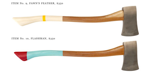
It is amazing what a little bit of design can do, even if the only added value is aesthetic. Best Made Company has added just a touch of design to a very classic object, an axe. They manufacture a range of axes with painted handles. Each colored handle is given a clever name to compliment nice design with good branding. The designs are released seasonally, like fashion lines.

If none of this season's axes appeal to you, you can always request a custom, ideal, design. Design and branding doesn't come cheap (thank goodness it adds value), axes range from $235-$550. Brilliant. I'm not sure how this is going over with the lumberjack community, but the design community is drooling.

If you visit the website, be sure the check out the inspiration page. It's raw, honest, and fantastic.

Microsocope

0510-microscope.jpg

Microscope is the self-reflective, senior project of design student, Matt Convente. He uses a series of posters to put himself under a microscope and express his thoughts, fears and desires. The posters have pleasant, simple graphics that enhance the sentiment of the text. Some of the images are direct representation of the thoughts, while others are meant as clarification to the true meaning.

My favorite part about this project is the categories. Matt has arranged his posters in categories of x10, x100, and x1000. The categories are intended to represent the level of magnification, or depth, that the poster reveals about him.

Texts From Last Night

Texts From Last Night is a funny new blog that features those text messages that you shouldn't have sent last night. Some of the texts from the collection have a voyeuristic appeal, well others are all about the intrigue at the hint of a fantastic story. But of course most of them are just plain head-shaking embarrassing. Submissions are posted annonomysly, using just the area code to show a glimpse of authorship.

Mercy Cards

Set Editions, creators of the brilliant Stop Talking cards, have come out with a new line of conversation cards. The new set is called Mercy. These ones are more like argument enders than conversation enders. The cards feature phrases like "You are right, I am wrong", "I don't even know what we're arguing about", and my favorite "Never, ever, bring this up again". A box of 24 cards is only $12... cheaper than flowers.

The Museum of Broken Relationships

0427-museumofbrokenrelations.jpg

When a relationship comes to an end, what do you do with all of the objects associated with that relationship? You know... the objects that have expired sentimental value attached to them? Sure you could take the fantastically therapeutic and non-environmentally friendly approach of ceremoniously burning them or throw them away as some sort of hazardous waste bag. Or... you could contribute them to the Museum of Broken Relationships.

The Museum of Broken Relationships is both a physical and virtual museum which promises to help an individual get rid of "controversial objects" that trigger "undesirable" emotions. It turns your objects from past relationships into a museum pieces, thereby "preserveing the collective emotional history". All contributions to the exhibit are submitted with info about the length of the relationship and story behind the object.

Keith Loutit Tilt Shift Videos

My friend Jason (obviously an avid One Floor Up reader) is feeding by miniature obsession with these tilt shift videos by Keith Loutit. Tilt shift is a photography technique used to make real life photos appear like scaled models, or miniatures. The technique distorts the depth of field through blurring, making the image appear as though it was taken using a macro lens.

Keith Loutit is one of the best at applying tilt shift to video. He actually combines tilt shift with time lapse photography to tell miniature stories. He has his own dedicated Vimeo channel. Most of the videos are part of a series called Little Sydney which features a new video each month, all shot in Sydney Australia. (Thanks Jason!)

Playing for Change

My dad sent me the link to this video a couple weeks ago. The video is an unlikely combination of street musicians from around the world playing Stand By Me. Each musician was recorded individually and then digitally edited together into the final fantastic song.

The video is part of an ongoing project called Playing for Change (great name!), which tries to use music to "break down boundaries and overcome distances between people". Although the Stand By Me video has gotten the most attention on the internet, there are actually seven videos so far, featuring different combination of street performers playing different songs. The other songs include One Love, Don't Worry, and Bring It On Home.

This is such a simple and effective idea. You can't help but love it. (Thanks Dad!)

Subprime

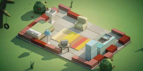
Mike Winkelman of Beeple has created an animated editorial on over-consumption. His short video features a spinning house being upgraded, expanded, and refurnished over and over again. The rotating and rebuilding visuals are completely captivating. The whole thing makes you question your own need vs want, consumer self. I will even, just this once, forgive them their isometric ways (perspective people, PERSPECTIVE).