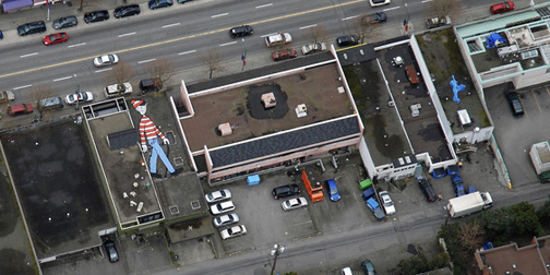
Where's Waldo, Google Earth Style

I was a huge Where's Waldo nerd in the late 80s, so I'm loving this idea.  Canadian artist, Melanie Coles, has created a Web 2.0 version of Where's Waldo by painting an image of Waldo on a secret rooftop.  The challenge is to be able to find Waldo on Google Earth.  Google's secret and sporadic updates of its satellite images mean that it's unpredictable not only where Waldo will show up, but when.  Melanie's Where On Earth is Waldo website encourages other people to hide Waldos by providing complete how-to instructions.
Ten Thousand Cents

I'm not sure why, but I'm totally enthralled by Amazon's Mechanical Turk.  I just can't get enough information about it.  I'm particularly fascinated by Aaron Koblin's artistic take on the the Turk (see previous post - The Sheep Market).  His latest project is Ten Thousand Cents, created in collaboration with Takashi Kawashima.  Thousands of Mechanical Turk workers were asked to paint a small section of a $100 bill using a custom drawing tool. They were paid one cent for their work. None of the workers were aware of the final image they were contributing to.  You can click on any image in the bill to watch how it was drawn.  Very cool.

Start Here Notebooks

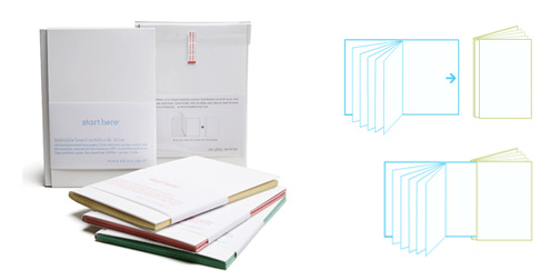
I like the simple but innovative idea behind the Start Here notebooks.  The notebooks link together to form larger notebooks.  This idea appeals to me because when you get to the end of a notebook it's not always a smooth transition to next one.  Linking them together, allows you to keep all your recent information together.  Then you are ready to fully commit to the new notebook, you can detach and cut down again.  Notebooks come in lined, blank, planner, or mixed formats.  Pocket or tab accessories are also available.

Pigeon Ring Necklaces

I was attracted to these Pigeon Ring Necklaces from Chinny Chin Chin.  It's an interesting concept of creating necklaces out of racing pigeon's tags.  I think it was the packaging that really sold it on me.  Each necklace comes with a stylin' portrait of the athlete, accompanied by some information about their likes and dislikes.  I like Mr. T who enjoys mice and malted milk biscuits but dislikes vegetables.  I'm going to get one of these for my friend Katy who adores pigeons.  (Found through Sub-Studio Design Blog).

Earth Hour 2008

0328-OneHourNoPower2.jpg

Tomorrow, March 29, at 8pm is this year's Earth Hour.  It was done last year in a few cities with limited participation.  This year, they have put a lot more effort into raising awareness and getting global participation on both an individual and corporate scale.  Participants are asked to turn out their lights between the 8 and 9pm.  The idea is to demonstrate that such a small act, can make a measurable change.

Takes All Types

0327-TakesAllTypes.jpg

Takes All Types is leveraging the power of Facebook to help with blood donations.  It's a Facebook application with a purpose.  Users register their blood type with Takes All Types and then notifications are sent to them when blood is needed in their areas.  This is one of the smartest Facebook apps I've seen.  It's raising awareness and building a blood donation network by using the enormous force of a social network.  If you are not a Facebook member, you can still register with Takes All Types to receive phone, text, email or fax alerts of blood shortages in your area.

Pretty Raccoon

0326-prettyraccoon.jpg

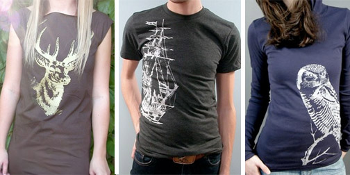
I'm sending some ETSY love out today to the PrettyRaccoon Clothing shop.  PrettyRaccoon is the clothing poetry Toronto designer, Andrea Winkler.  It features conservative, yet stunning graphics printed onto some traditional, and some not-so-traditional, American Apparel shirts, dresses, scarves and bags.  The average price of PrettyRaccon's pieces is in the $30 range.  So many tempting choices...

Designing The News

0326-weekinguardian.jpg

I'm enjoying Dave Bowker's website, Designing The News.  Dave describes the site as "A series of experiments which visually explore the news in various ways to encourage new ways of seeing a predominantly text based medium."  David has a cool throwing-it-out-there approach to his ideas which I appreciate.

I was attracted to his most recent visualization experiment, One Week of The Guardian: Wednesday.  Each circle represents a different news category, arranged from the center outwards according to each category's total word count.  His idea expands out to link the category rankings from one day to another to track a whole year's worth of news stories.  This is a cool overall visualization.  It reminds me a bit of the Digg Labs work, but with a rockn' retro color scheme.

Bert Simons

0324-bertsimons.jpg

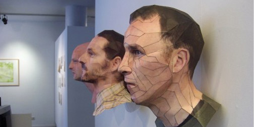
Check out these crazy paper heads by artist Bert Simons.  His sculptures strike a really cool mix of fine art and CAD.  They tread an interestingly fine line between real and digital sculpting.  Bert creates the heads using the dot per dot reference method to represent a real face in 3D.  He then uses Blender to render and flatten the image.  Pieces of the image are printed and reconstructed like a 3D puzzle.  The explanation behind the methodology and thinking, as well as some of the 2D print files are up on Bert's website.  (Found through Hip.Young.Thing).

D/A Clock

0320-da_clock.jpg

I've seen Alvin Aronson's D/A Clock a few times.  I thought it was a sleek, modern take on a digital clock, but I didn't really get the idea that it was a digital/analogue clock until I watched this YouTube video of the clock in action.  The lit numbers of a digital clock have been replaced by a physical representation of the numbers.  Each minute transforms into the next to show a more ongoing view of time, much the same way an analogue clock does. (Thanks Jason!)

Nokia Nseries Urbanista Diaries

0318-urbanistadiaries.jpg

The Nokia Nseries has created an interesting website where they tell a tale of 4 bloggers traveling around the globe and taking pictures, to help sell the Nokia 5 megapixel, GPS enabled phones.  The advertising story goes like this... "Once upon a time, 4 travelers began a global quest.  They beat a path through our urban jungles to seek out untold stories - to capture time, only to release it back into the world.  And they laid out a trail so we cannot lose them".  You can track the bloggers' travels and view their geo-tagged photos as the post them.  It's a cool, overly dramatized take on selling a  phone - I like it.  (Found through Comuptuerlove).

Publicis & Hal Riney Website

I've been playing around with the Publicis & Hal Riney website. They have provided the option of navigating the website through gestures picked up by your webcam. I've seen this idea demoed before, but I've never just come across it on a website. I have to admit, the first time I tried this, it wasn't working for me at all. My interpretation of the gestures was a bit too exaggerated (or their interpretation wasn't exaggerated enough). Once I figured it out, I was really enjoying the interaction experience. The novelty of the physical action (beyond my finger on the mouse) kind of snapped me out of my normal internet browsing glaze and made me pay much more attention to the content. It also kept my interest and made me explore much more of the site then I might have otherwise.

Free Municipal Wi-Fi

0316-freewifi.jpg

I was fascinated by Wired Magazine's map of Free Municipal Wi-Fi across the United States.  I knew about some of the bigger initiatives (San Fransisco, Chicago, etc.) but I had no idea how many other towns and cities are working on providing free, government-sponsored wireless access.  I guess in some ways it makes sense, since free municipal Wi-Fi seems like it would be much easier to implement on a small scale.  I'd love to see some global information about cities going Wi-Fi.

Help

0312-help.jpg

I'm head over heals (spelling error intended) for the folks over at Help.  Their product offering is pretty simple.  It consists of two products: Acetaminophen tablets entitled 'Help I Have a Headache' (Ha!) and band aids entitled 'Help I've Cut Myself' (Haha!).  Their product line alone totally had me sold on the company... but there's more.  They also try to be socially responsible.  All of their packaging is made out of 100% recycled molded paper pulp and manufactured in the US by a factory that helps adults with learning disabilities.  They also have a sense of humor.  You can order customized 'Help I...' t-shirts on their website, where you fill in the blank with whatever tickles your funny bone.  If all that doesn't make them awesome enough, they also offer other Help activities such as Help I'm Bored, Help I'm Illiterate, or Help I'm Homesick (my personal favorite!). I'm not sure who is behind the company Help, but I've decided you are totally awesome!