Portfolio - Diego Monetti
/
The brilliant and egotistically-over-the-top-awesome portfolio of Interactive Experience Designer, Diego Monetti. Shaking my head out of envy, amusement and shock.
Someone please hire him and report back.
The brilliant and egotistically-over-the-top-awesome portfolio of Interactive Experience Designer, Diego Monetti. Shaking my head out of envy, amusement and shock.
Someone please hire him and report back.
Designboom has been asking the interview question "What is the best moment of the day?". It is a fantastic question with even better answers. Each answer is acting as a headline for the full interview.
I'm enjoying Dave Bowker's website, Designing The News. Dave describes the site as "A series of experiments which visually explore the news in various ways to encourage new ways of seeing a predominantly text based medium." David has a cool throwing-it-out-there approach to his ideas which I appreciate.
I was attracted to his most recent visualization experiment, One Week of The Guardian: Wednesday. Each circle represents a different news category, arranged from the center outwards according to each category's total word count. His idea expands out to link the category rankings from one day to another to track a whole year's worth of news stories. This is a cool overall visualization. It reminds me a bit of the Digg Labs work, but with a rockn' retro color scheme.
Fantastique! I just listened to this TED Talk by Philippe Starck, and smiled from start to finish. He talks about his useless job of being a designer - very inspiring (seriously). Whether you think you are a Philippe Starck fan or not, this talk is well worth 18 minutes of your time.
Ben Fry is a fabulous designer/artist/computer scientist who focuses on visualizing data. This project, called Distellamap, (a spin-off of Dismap) highlights the beauty of code. The project features the code of 6 different Atari games overlaid with curves to show its 'go to' elements. The visualization emphasizes the flow of the code, showing it off as a complex piece of poetry. (Found most recently through Pica + Pixel).
Planet Earth - Directions for Use' was Angie Rattay's entry for the Designboom 'Love Your Earth' graphic design competition. It is a series of four instructional pamphlets designed to resemble medical directions packed into a small prescription style box. Each manual focuses on a different part of the Earth; the atmosphere, the biosphere, the hydrosphere, and the lithosphere/pedosphere. Each set of 'directions' includes information about its relative part of the Earth and instructions on how readers can reduce their impact on that area. I would love a copy of this. It seems incredibly well thought out and executed.
World, meet Industrial Designer and digital music artist extraordinaire, Eric Johnson. Eric just debuted two of his most recent musical experiments at Etsy Labs Handmade Music nights. The first was his very entertaining Theremin Crutches. He recycled an old pair of crutches into a large theremin. The result looks and sounds like someone releasing all the stress the crutches have collected. Love it!
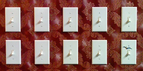
Eric's other project, Sixty Switches of Fury, is even more fabulous. It's a controller made to look like a piece of suburbia. The large section of wall houses 60 (now 61) light switches each controlling a music sample. The switches are arranged in octives like a keyboard, but unlike a keyboard you don't have to hold the keys down. Instead you just turn the switches on or off, creating a more natural and useful interface for those of us with only 10 fingers.
I appreciate Eric's approach to musical instruments because he comes at it from a design background and not just a musical one. The end result is all about the user interface and the interactive experience. The fabulously entertaining music is just a bonus. Eric's work was recently been featured by Wired and Time Out New York. May I just say that Nerdsters are awesome!
I attended a talk by Tom Dixon earlier this week at HauteGREEN 2007. Part of his talk was about this project, the Trafalgar Great Chair Grab. The thinking behind the project is that a lot of designer objects are very expensive and not affordable to many people. Tom Dixon was attempting to give design away for free by filling Trafalgar Square in London with chairs he designed and then just inviting people to take the chairs home with them.
This is an interesting idea in itself but what caught my attention was the second half of the scheme. In order to fund the project he took one of the chairs and left it in a copper bath in an effort to make one 'precious' or valuable version of the chair to sell. The idea being that one precious object would pay for the others.
It was dark and rainy here in New York today and it reminded me of the Sky Umbrella designed by Tibor Kalman. This umbrella lets you to carry around your own little piece of blue sky. Tibor Kalman was a co-founders of one of my favorite magazines, Benetton's Colors. This umbrella demonstrates Tibor Kalman's inspiring ability to make a statement through the use of images. The Sky Umbrella is available through the MoMA Store.
The Lace Fence is a product from Dutch design house Demakersvan. It is a chain link fence where a section had been replaced with embroidered wire. Designed for both indoor and outdoor use, this is a great example of bringing beauty to something which is primarily functional. The creators describe the Lace Fence as 'hostility versus kindness' and 'industrial versus craft'.
In first year university we had do design a cardboard bookshelf that was to be judged, not only on aesthetics, but by how much weight it could hold compared to the amount of cardboard used. As a result, I have developed an ongoing fascination with furniture make out of cardboard.
Swiss architect Nicola Enrico Staubli has designed a line of furniture based on folding cardboard. What is interesting about his approach is that he is not selling the furniture; in fact he is not actually selling anything. His designs are meant to be constructed by you (yes you). Printable templates are downloadable from his Foldschool website. Nicola says the thinking behind foldschool is "To restore design to one of its original missions: to provide a product at an affordable price through a smart manufacturing process" and presumably by smart manufacturing in this case he means elbow grease. (Thanks Ostrowski!)
Design Sponge had a posting yesterday about Cinq Cinq Designers. I really like these sugar cube cup handles but what I think is even more brilliant is the mouth shaped chocolates! There is a range of shapes to melt in your mouth just the way you like it... flat on the tongue, roof of the mouth, between tongue and cheek. Why didn't I think of this!
The ladies from FRONT design in Sweden have developed a method to turn free hand sketches into real objects. They use Motion Capture to record their pen strokes in the air. The data is turned into 3D files and sent to a rapid prototyping machine. The result is not exactly pretty but I like the interesting mixture of processes.
Watch the process on this You Tube video.
Check out the witty work of James McAdam. This Good Morning Sunshine pillow leaves a greeting on your cheek instead of just plain old pillow creases. His Wake Up Alarm is a calibrated jug allowing you to drink just enough water to wake you at a specified time.