New Pepsi Logo

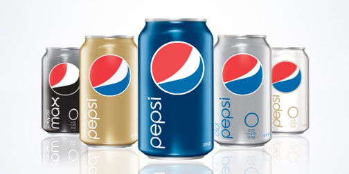
Pepsi updated their logo and product graphics a few months ago.  Like any rebranding, there have been mixed reactions.  Personally, I really like them.  I appreciate that have given some life to the brand by allowing the logo to be slightly organic.  The stripe in the Pepsi logo changes size according to the beverage type.  Diet Pepsi gets a skinny stripe and Pepsi Max gets a seriously fat stripe.  I am pretty sure that this goes against all traditional branding rules, but I like it.  It actually gives the brand a little more personality.  I hope the trend catches on.  (Thanks Brett).

ASDA Lunch Boxes

1219-ASDA-lunchbox.jpg

These lunch boxes are a great example of packaging design by Emma Smart.  Each sandwich box opens up into an image of a place setting.  There are three different lunch box themes (Satisfying, Healthy and Children's), each with an appropriate design.  I would be so thrilled if I opened my lunch box to find this.  It shows how much emotional enjoyment design can add to an experience.  Emma created these lunch boxes for ASDA as part of a student project a few years ago.

Interactive Subway Installation

1217-subwaytouch.jpg

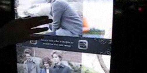
Ginga Interactive in Brazil has been working hard to promote the movie Twilight.  One of their advertising approaches has been a series of interactive posters in Sao Paulo subway stations.  The posters are touchable, allowing subway passengers to explore the content.  They can watch and control clips from the film, browse character profiles and download information to their mobile phones.  Watch a video of the interactive posters here.

Plug into Now

1110-now.jpg

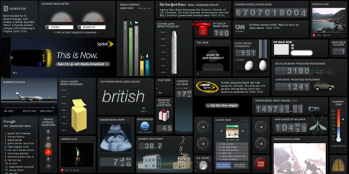
I generally browse the web on high speed.  Sprint's Now Network Widget made me stop in my browsing tracks and pause in one place for a few minutes.  The widget displays all sorts of semi-useless, but incredibly interesting information about what is happening around the world and the web right now.  Displayed info includes tons of eggs being produced, the top word being used online, number of calls being made to 911, and much more.  I'm still watching the numbers tick...

SF Zoo Critter Quest

0730-sf-zoo-ad.jpg

The San Fransisco Zoo has a fun participatory ad campaign called Critter Quest.  They use a series of 4 bus shelter poster depicting pieces of animals.    Passersby are encouraged to take a picture of themselves as a peacock, giraffe, butterfly or kudu and send it to the San Fransisco Zoo website gallery.  This is a great advertising idea.  It's fun, it gets people interested and involved, and it gives people a reason to visit the website.  (Found through Marketing Alternatif).

Get London Reading

0527-getlondonreading.jpg

Get London Reading is a campaign to encourage Londoners to make more time for reading.  The campaign includes this great advertising graffiti (featuring book quotes) and a fabulous interactive map showing books set in the different neighborhoods.  This is a nice idea for people living in London as well as visitors to the city.  It encourages reading or allows you to experience the communities where your favorite books took place.  More cities should adopt this idea.

Nokia Nseries Urbanista Diaries

0318-urbanistadiaries.jpg

The Nokia Nseries has created an interesting website where they tell a tale of 4 bloggers traveling around the globe and taking pictures, to help sell the Nokia 5 megapixel, GPS enabled phones.  The advertising story goes like this... "Once upon a time, 4 travelers began a global quest.  They beat a path through our urban jungles to seek out untold stories - to capture time, only to release it back into the world.  And they laid out a trail so we cannot lose them".  You can track the bloggers' travels and view their geo-tagged photos as the post them.  It's a cool, overly dramatized take on selling a  phone - I like it.  (Found through Comuptuerlove).

Help

0312-help.jpg

I'm head over heals (spelling error intended) for the folks over at Help.  Their product offering is pretty simple.  It consists of two products: Acetaminophen tablets entitled 'Help I Have a Headache' (Ha!) and band aids entitled 'Help I've Cut Myself' (Haha!).  Their product line alone totally had me sold on the company... but there's more.  They also try to be socially responsible.  All of their packaging is made out of 100% recycled molded paper pulp and manufactured in the US by a factory that helps adults with learning disabilities.  They also have a sense of humor.  You can order customized 'Help I...' t-shirts on their website, where you fill in the blank with whatever tickles your funny bone.  If all that doesn't make them awesome enough, they also offer other Help activities such as Help I'm Bored, Help I'm Illiterate, or Help I'm Homesick (my personal favorite!). I'm not sure who is behind the company Help, but I've decided you are totally awesome!