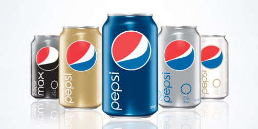
New Pepsi Logo

Pepsi updated their logo and product graphics a few months ago.  Like any rebranding, there have been mixed reactions.  Personally, I really like them.  I appreciate that have given some life to the brand by allowing the logo to be slightly organic.  The stripe in the Pepsi logo changes size according to the beverage type.  Diet Pepsi gets a skinny stripe and Pepsi Max gets a seriously fat stripe.  I am pretty sure that this goes against all traditional branding rules, but I like it.  It actually gives the brand a little more personality.  I hope the trend catches on.  (Thanks Brett).

ASDA Lunch Boxes

1219-ASDA-lunchbox.jpg

These lunch boxes are a great example of packaging design by Emma Smart.  Each sandwich box opens up into an image of a place setting.  There are three different lunch box themes (Satisfying, Healthy and Children's), each with an appropriate design.  I would be so thrilled if I opened my lunch box to find this.  It shows how much emotional enjoyment design can add to an experience.  Emma created these lunch boxes for ASDA as part of a student project a few years ago.

PT3

0721-arulidenpingpong.jpg

This fabulous PT3 table tennis packaging was created for Puma by the brilliant Aruliden design and branding consultancy.  The design is made up of two plastic halves held together by magnets, housing the paddle and ball sets.    The design is simple and elegant.  I've used this image in most of the image boards that I've done this year.  This design recently won two prestigious design awards: an IDEA Bronze award in the Leisure & Recreation category and a I.D. Annual Review Best in Category award for Packaging.

Easy PB&J Jar

0527-ezjar.jpg

Mmmm, I love peanut butter.  Everyone who loves peanut butter knows how much it sucks to get to the bottom of the jar (and not just because you are out of PB).  Even if you are a talented scraper, the bottom of the jar is hard to get to, especially without getting peanut butter all over your hand or knife (or spoon if you are so inclined). Anyway... Sherwood Forlee has solved all of my problems with this Easy PB&J Jar.  It includes the simple but brilliant improvement, both ends open to easily access the bottom of the jar.

Help

0312-help.jpg

I'm head over heals (spelling error intended) for the folks over at Help.  Their product offering is pretty simple.  It consists of two products: Acetaminophen tablets entitled 'Help I Have a Headache' (Ha!) and band aids entitled 'Help I've Cut Myself' (Haha!).  Their product line alone totally had me sold on the company... but there's more.  They also try to be socially responsible.  All of their packaging is made out of 100% recycled molded paper pulp and manufactured in the US by a factory that helps adults with learning disabilities.  They also have a sense of humor.  You can order customized 'Help I...' t-shirts on their website, where you fill in the blank with whatever tickles your funny bone.  If all that doesn't make them awesome enough, they also offer other Help activities such as Help I'm Bored, Help I'm Illiterate, or Help I'm Homesick (my personal favorite!). I'm not sure who is behind the company Help, but I've decided you are totally awesome!

LINC - The Lifecycle Concept Phone

0302-LINC.jpg

The amazing designers at Kaleidoscope's Greener Grass project have come up with another interesting cell phone concept.  Inspired by their attendance of the Greener Gadgets Conference, the LINC phone concept was designed with the product's entire lifecycle in mind.  The phone is made to be easily disassembled.  When LINC's hardware becomes obsolete, users are asked to ship in back to the company in exchange for an updated phone.  The manufacturer then easily disassembles the phone using a directed radiant heat beam which targets its internal memory metal latch, releasing the assembly.  The phone's components (glass, metal, electronics, etc.) are all appropriately recycled, reused, or safely disposed of (in the case of hazardous materials).  In the quick and ever changing world of technology that we live in, it's great to see product designers not only focusing on how the product is used, but what happens to it when it needs replacing.

Vuru

1010-Vuru_Packs.jpg

Vuru provides an interesting service.  They create customized daily vitamin and supplement packages for their customers.  You can go to their website, enter in the daily supplements you take and they will send you a supply of individually packed pills that match your daily intake.  I think this is a really smart idea. It saves people a lot of time and effort, especially if you take more than a couple supplements a day; it avoids the hassle of all of your pills running out at different times; it's especially useful for people who travel a lot, packing your vitamins means just grabbing a couple of packs; and if you have to take some vitamins when you are out for lunch or dinner, just take the resealable bag with you.  I've seen a lot of great redesigns for the weekly pill box, but the simplicity of this solution puts them all to shame.