AutoKratz's Stay the Same Video

0106-partizan.jpg

I have been admiring the artistic use of infographics in the AutoKratz Stay the Same video.  It was directed by Laurie Thinot of Partizan Labs.  The storyline is a little strange, but animation and flow are noteworthy.  I was especially taken by the color pallet used.  The dark, rich colors accentuate the illustrations and the old school projector effect.  (Found through Motionographer).

Show Me How

I bought the book Show Me How - 500 Things You Should Know because I was looking for a good example of instructional graphics.  I was pleasantly surprised to find out that the book not only has inspirational illustrations, but also some very funny and useful content.  It has step by step instructions for a wide range of things from how to boil an egg to how to create a chain-mail bikini.  I can't wait to read and acquire new skills.

Cat Play House

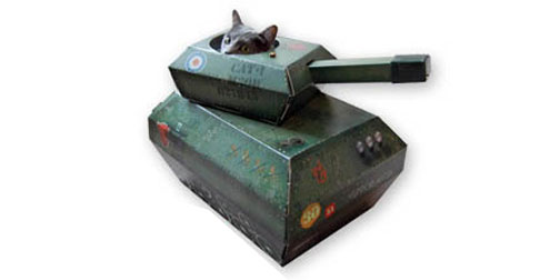
Ha!  I cannot imagine a better cat toy than this paper cat house by Suck UK.  I mean, cats love boxes, and people love making their cats do stupid things for our amusement.  So it's win-win.  The Cat Play House is also available in a firetruck or an airplane.  Oh, and if you are not already convinced, check out the collection of photos and videos of kitties just loving their new toys.

Daily Routines

I just discovered an endearing blog called Daily Routines.  It collects stories about how artists, writers and other interesting people organize their days.  It is a nice little glimpse into people's creative processes. I can't stop reading them.  More importantly, I can't stop wondering how so many creative people are so disciplined.  Gosh, doesn't anyone sleep in?  I would actually read this blog even more if there were more mundane, everyday people writing in. It's always so fascinating to get a look into other people's daily routines and methodologies.

A New Bus for London

Transport for London recently ran a competition to redesign their iconic London buses.  The contest was open to anyone, which sparked a wide range of entries.  The winners were divided into two groups: The Imagine Winners and The Design Winners.  The Imagine winners were any inspirational idea entries.  This category features some creative designs from children, teens and adults alike.  The Design winners feature more technical entries of the bus itself, or elements therein.  One of my favorites is the entry shown above by Hector Serrano Studio.  I'm impressed by the range of entries and ideas all based around such a classic starting point.

ASDA Lunch Boxes

1219-ASDA-lunchbox.jpg

These lunch boxes are a great example of packaging design by Emma Smart.  Each sandwich box opens up into an image of a place setting.  There are three different lunch box themes (Satisfying, Healthy and Children's), each with an appropriate design.  I would be so thrilled if I opened my lunch box to find this.  It shows how much emotional enjoyment design can add to an experience.  Emma created these lunch boxes for ASDA as part of a student project a few years ago.

Listen and Record

Listen and Record Wallpaper is part of Ihas Fotopoulos' Series Two wallpaper collection.  The whole collection was influenced by dots and lines from unexpected sources.  the Listen and Record patterns are based on braille.  They also have a fascinating story associated with them.  The story, by Juro Osawa, is about recording his voice every night before bed and then listening to the recording exactly one year later.  He's been doing the every day for 11 years!  I can't do the story justice, so make sure to look it up on the website yourself.  I'm not entirely sure how the story relates to the wallpaper, but it kind of doesn't matter because the story is so good.

Eatbite

1217-citybite.jpg

A picture is worth a thousand words, or rather a mouthful of drool.  Eatbite.com helps you figure out what you want to eat, using a picture flashcard method.  You scroll through photos of food from New York restaurants and when your mouth starts to water and you tummy grumble, you can hit BITE to see the restaurant on a map.  Images can be sorted by location, price, or descriptive tags.  The site's users are encouraged to post their own food pictures and add comments or tags to other people's images.  I like this idea a lot.  It combines a few simple features to provide a minimal but useful application that takes into account the emotional aspect of making decisions. (Found through Springwise).

Interactive Subway Installation

1217-subwaytouch.jpg

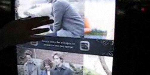
Ginga Interactive in Brazil has been working hard to promote the movie Twilight.  One of their advertising approaches has been a series of interactive posters in Sao Paulo subway stations.  The posters are touchable, allowing subway passengers to explore the content.  They can watch and control clips from the film, browse character profiles and download information to their mobile phones.  Watch a video of the interactive posters here.

Microwave Carol

One of my favorite parts of the holiday season is the inventive greeting cards that creative agencies come up with.  This year one of the most impressive has been the holiday video put out by AKQA.  It is a Christmas take on found object music.  In this case they play Jingle Bells using microwaves set to different times with different toned alarm bells.  This sounds like something Eric Johnson would do.

Jumping in Art Museums

Oooo, yet another deliciously brilliant idea to add to my To Do List... Jumping in Museums.  Allison Reimus has a blog dedicated to her love of jumping in art museums.  She says "Sometimes, while visiting art museums and galleries, I am so excited by what I see that I have to jump for joy".  Allison encourages readers to send in their own jumping in museum photos with info about who they are, what museum they were in and the painting they chose to jump in front of.  She also organizes jumping events.  One such event happened this past week at MoMA in NY.  I might just have to swing by the local art gallery tomorrow.

I Feel Maps

1212-moodmap.jpg

We all make decisions based on emotions.  Andy Whitlock has tried to simplify these decisions for us by mapping points of interest based on feelings.  He is currently testing I Feel maps for 3 cities: London, New York and Toronto.  Users can choose their current emotion and see what others in the city do when the feel naughty, energetic, broke or hungover (amongst others).  The maps are just in the beginning phases and looking for more contributions.

i/denti/tee

1206-identitee.jpg

i/denti/tee is a t-shirt company based on around the love of music.  They create simple text t-shirts with music lyrics on them... but only lyrics beginning with the letter "i"... because as they state, those are the most personal lyrics.  Some of the lyrics make for very entertaining t-shirts.  Some of my favorites are "I wanna dance with somebody" and "I used to rule the world".  The site itself is also very entertaining.  There are lip sync videos (always a crowd pleaser) and you can vote for your favorite i-lyrics and post your list to your favorite social site.  T-shirts are $35 and include 10 free iTunes downloads.

Teeny Tile

I enjoy companies that come up with new and interesting ways to make stuff out of my photos or images.  The newest addition to my Photo-To-Do-List is Teeny Tiles.  They create small 2" x 2" tiles out of your pictures.  The tiles can be used as tiles are intended to be used, or they are also backed with a magnet for less traditional mounting scenarios.  I think this could get cheesy really fast, but I also see huge potential to do something creative.  Tiles cost $5 each and take about a week to get.