Incredibox

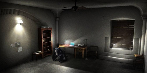
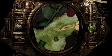
Incredibox is a interactive website that allows users to mix their own beatboxes using the skilled sounds of The Incredible Polo. The website is fun and super simple to use. You just drag and drop the types of sounds on the the beatboxer's t-shirt to add to the mix. Click on any of the beatboxers to remove their sound. The end effect is really enjoyable to experience.

We're All Gonna Die

Photographer Simon Hogsberg has created a beautiful, explorable, 100 meter image, of people crossing a railroad bridge.  The project is called We're All Gonna Die.  The subject of the photos are 178 pedestrians, photographed over 20 days in Berlin.  The photos are stunning.  You can't stop looking at the people.  Some of the people clearly notice their picture being taken, and others are so lost in their thoughts that you can't help wondering what they are thinking about.  I'm going back to look some more...  (Found through Cool Hunting).

GE Smart Grid Website

GE has a beautiful new interactive website to promote their Smart Grid innovations.  The website is stunning, with intelligent interactive features like a print and play augmented reality Smart Grid.  The forward thinking website reflects well on their forward thinking ideas about energy.  GE has some intriguing ideas about integrating alternative power sources and smart meters into consumer's lives.  They make a convincing argument by visualizing the potential impacts.

AutoKratz's Stay the Same Video

0106-partizan.jpg

I have been admiring the artistic use of infographics in the AutoKratz Stay the Same video.  It was directed by Laurie Thinot of Partizan Labs.  The storyline is a little strange, but animation and flow are noteworthy.  I was especially taken by the color pallet used.  The dark, rich colors accentuate the illustrations and the old school projector effect.  (Found through Motionographer).

Greg Washington Portfolio Site

I was reminded of Greg Washington's portfolio site today.  I first saw it about 4 years ago, and to this day it remains one of my favorite portfolio examples.  The main background for the site was Greg's hands and face squished up as if on a scanner.  His breathing was reflected in the glass.  The whole effect was just so unique and brave that I remember thinking - if I received this portfolio I would hire him immediately.  Unfortunately the original site is no longer up but you can see some images and video of the website on Greg's Behance page.

If someone has a more interesting portfolio example, please send it in.  I'm always looking to be impressed by portfolio sites.

CDX Game

1117-cdx.jpg

CDX is a interactive video adventure created by the BBC and the always inspiring Preloaded.  The game was designed to accompany the BBC mini-series Ancient Rome but it's a fabulous stand alone piece.  The game is educational in a very subtle way.  It reminds me of a modern, adult version of Where in the World is Carmen Sandiego.  Preloaded used a combination of Maya Renderings, video, and Flash to create this online adventure.  CDX won this year's Flash Forward Game category.

Diesel Style Lounge

1115-Diesel_StyleLounge.jpg

A new online Diesel store recently launched featuring this mesmerizing Liquid Space Style Lounge. It has the same dark underwater feel as their amazing holographic fashion show did.  The clothes are shown on floating models.  To add to the effect they have also changed the behavior of the users cursor in the lounge so it feels as though you are pulling it through the water.  Great combination of effects.  On a side note, this is supposed to be one of the most complete online Diesel stores ever, including items from the runway not available in most stores.  (Found through The FWA).

Filippa Smedhagen Sund

0905-filippasmedhagensund.jpg

I like the portfolio of Swedish Makeup Artist Filippa Smedhagen Sund.  It contains some gorgeous photography of her work.  What I like most about the site is the interface.  Upon entering the site you get quick instructions on how to navigate, and then off you go.  The interface is simple enough that you could probably figure it out yourself but I like the courteous idea of just showing people what to do up front.  It makes users much more receptive to new interface styles.  The site was designed by the Berlin based company, Mocoro.

What's Bubbling Up?

0810-bubbling_up.jpg

I've been playing around today with What's Bubbling Up.  It's a promotional site for Unicel, created by the brilliant minds at Kelliher Samets Volk.  The site focuses on the idea of making connections by allowing users to create and post messages.  I always enjoy sites based on user content, especially when they invite people to share something they might not normally.  I also really enjoy the thought of unspoken conversations being these lingering speech bubbles - it's a cool visual.  This site reminds me of one of my favorites, the Hope Garden.  (Thanks Jackie!)

Anymails

0806-animail.jpg

Anymails is a fun and informative visualizer for your email inbox.  It represents email using the natural metaphor of microbes.  Different species of microbes represent email from different groups of people (i.e. Family, Job, Spam).  The  size and color of the microbes show the age of the email and the hairiness indicates the email's unread, read, or responded to status.  Anymails was developed as the thesis project of Carolin Horn with coding by Florian Jenett.  Great use of Flash and Processing ladies!  (Found through Josh Spear).

HBO Voyeur

0712-HBO_Voyager.jpg

HBO's amazing new Voyeur website allows you to peak into the windows of five New York apartment buildings.  It's a stunning Flash website created by the Brooklyn based Big Spaceship that combines video, music and colors to great dramatic effect. At each building you watch the story or stories unfold over a matter of days.  There is something disturbingly captivating about watching people through windows.  The site is part of a larger experimental 'Hyper Media' advertising campaign by HBO.

Vitamin Water Website

0628-Try_it.jpg

The Vitamin Water section of the Glaceau website has been making me laugh.  They have come up with funny 'Try It' sayings for each flavor to attempt to explain the effect of the drink.  For example 'Try swimming the Atlantic when you've just swam the Atlantic.  Try Revive.  Try it.' or 'Try kissing a poison dart frog until it turns into a prince.  Try Endurance.  Try it.'  You can also create your own sayings using the Try It Creator and then post the custom advertisement to your blog or myspace page. I find this very interesting because on the one hand they are giving up control over what their advertisement says, but on the other hand the ads that people come up with are probably even more relevant to the readers.

C-Class Website

0618-Mercedes_C-class.jpg

I found this website for the new Mercedes C-Class kind of interesting.  They have come up with some keywords to describe the C-Class; energy, simplicity, balance, space, interaction, confidence.  To get across the meaning of each of these concepts they have created little interactive activities to allow you to experience the meaning of each word for yourselves.  For example the 'Interaction' demo asks you to navigate an invisible maze.  The maze is just trial and error until the navigation assistance kicks in, then it is easy.  These simple activities are a very effective way of getting across the key messages. (Found through FWA)