William Hundley Photographs Ghosts

1031-Photographing_Ghosts.jpg

William Hundley photographs ghosts... or something.  The 'or something' apparently being his friends jumping in bed sheets.  This looks like a fun photography/Photoshop project to try out.  I doubt it is quite as easy as it sounds (unless your friends are professional canonballers, cheerleaders, or just plain fabulous jumpers).  I just like the idea that ghosts where bedsheets, especially in broad daylight.  Check out the rest of William Hundley's Entoptic Phenomena series here. (Found through Photojojo).

Flo

1030-boon-flo.jpg

Boon makes gorgeous products for children and babies.  They describe their products as 'innovations for modern parents'.  They have a lot of great ideas.  I particularly like this Flo water deflector.  It fits over your bathtub's faucet, covering the sharp edges and creating a gentle waterfall of water.  It even has a bubble bath reservoir and dispenser button.  I kind of want one.

Windowherbs

1029-Zo-Windowherbs.jpg

Windowherbs are a great solution to making fresh herbs part of your daily cooking routine.  They are half pots of herbs that come with suction cups to allow you to stick them right to your kitchen window.  The pots are not only a smart design, but also a very good looking one.  The clear pots with simple labeling would suit any kitchen.  Windowherbs were designed by Tineke Beunders of ZO.

MAC Cosmetics' Halloween Looks

1029-MAC-Halloween.jpg

The MAC Cosmetics site has a section called 'Looks' where they demo different makeup styles.  One of their current sets of Looks is Halloween.  They have some great Halloween makeup suggestions including Dark Things, Optical Illusions and Robotniks.  Each Look is printable and gives a full suggestion of the products used to create it.  I think this is a great promotion for a cosmetics company.  It's fun and shows the versatility of their products.

Pulp Star Customizable Fiction

1027-pulpstar.jpg
"A hard-boiled private dick and a beautiful dame team up to investigate the death of her sister. In this treacherous whodunit, the question of suicide or murder plunges an exclamation point into the heart of every breathless pulse!"

... and the characters are customized by you!  Pulp Star provides pulp fiction books which are fully personalized to your specifications.  You get to name and describe the physical traits of the characters (including hair color, body type, nickame, etc.) and your personalized book is printed specially for you.  You can even opt for a customized cover to match your characters.

NYC Taxi Logo Uprising and Action

1023-18taximodel.jpg

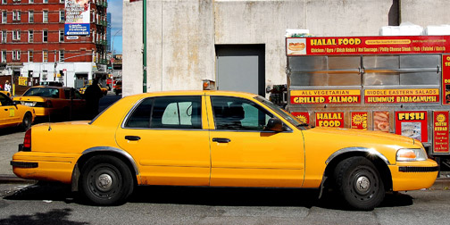
New York City Taxis just introduced their new logo a week or two ago.  It has been hit with some pretty harsh criticism from all directions.   In a response to a NY Times online article about the logo, one supporter wrote a comment saying 'Dear Everyone Who Thinks They Can Do Better: Please post a link to your design so it can be critiqued as well'.  Which is fair enough.  What I love about this is that the NY Times took the commenter up on this and have created an page on their site where you can download an image of a taxi (with no graphics on it), create your own concept and post it for everyone to see.  Ha!  So, if you are one of those people with nothing but bad things to say about the new taxi logo, go ahead and back up your criticisms with a suggestion...  I plan to.

Artek 2ndCycle

1022-2ndcycle.jpg

Artek has a really fascinating environmental initiative called 2ndCycle.  They are buying back original Alvar Alto furniture and then reselling it again.  No, they are not bothering to refinish it or anything like that.  They are essentially selling it used in whatever disheveled (or not-so-disheveled) state that they found it in.  So what is their angle?  Well, it's a couple of things.  First, they are trying to celebrate the idea of an original.  There is value in older designer furniture.  It is a piece of art.  Secondly, they are reinforcing the quality of their product line.  All of this furniture has held up over time.  The last aspect of their new-to-you story is that the furniture has gained value though use.  You are not just buying some piece of furniture straight off the assembly line.  You are buying something with a story, a history to it.    To play up this aspect of the furniture, each piece comes with an identifier number and an RFID tag that allows you to track and view its history.  I love this idea.  It's much more of a traditional view on furniture than a modern consumerist one.

I attended a talk by Tom Dixon where he spoke about Artek's 2nd Cycle line.  Interestingly, part of the reason that there is so much used Alvar Alto furniture around is that most of it was originally sold to government institutions in Finland such as schools, hospitals and churches which don't spend the money to replace their furniture very often.

Belkin N1 Vision

1018-N1-Vision.jpg

I found myself in Best Buy a few weeks ago staring at the Belkin N1 Vision and daydreaming about how I could sabotage my own wireless router to justify buying this one.  My desire was not without reason.  This router has a lot of great features including CD-less installation and a vertical orientation to reduce its footprint on your desk/floor/whatever.  The really big improvement that they have made over other routers is adding a screen.  The display shows all sorts of useful information such as upload and download speeds, current wireless users connected, and activity over the past 24 hours.  This makes the router an valuable part of your internet setup and not just a box with blinking lights under your desk.

WWF Paper Towel Dispenser

1018-wwf-papertowel.jpg

This paper towel dispenser/advertisement, sponsored by the World Wildlife Fund, caught my attention.  Their slogan is 'Save Paper. Save the Planet'.  They try to reinforce the direct correlation between using paper and destroying forests by showing the diminishing paper towel level through a map of South America.  As much as I like this idea, I have to admit that I didn't really understand it right away.  The relation between South America, the rain forest, and paper towel  was a little too far removed for an at-a-glance message.  I think it would have been clearer if they had just shown the cutout as a tree.  Then I would have  immediately understood the correlation and felt guilty before I reached for a paper towel instead of after.  Great idea none the less.  (Found through I Believe In Advertising).

Gwen Stefani Content on HP Site

1017-gwen.jpg

I heard a comic the other day doing a funny bit about how silly it is that gum companies have websites.  The gist of the bit was, do you chew your gum and think 'Wow, this gum is really good.  If only I had more information about it'.  It made me laugh, but it also make me think.  Which is more ridiculous, not having a website or having an essentially useless website?

Some companies have gone out of their way to make potentially uninteresting websites interesting.  HP is an example that comes to mind.  They have smartly added an Activity  Center to their website.  It features fun and easy projects that are designed to make you think about all the great things you can do with a printer.  Recently they have been promoting the Activity Center though their collaborative projects with Gwen Stephani, featured on her HP commercial.  This is a great way to draw people to their website, a good use of combining tv and web content, and an effective use of their creative celebrity endorsement deals.

Jesus College Cambridge

1015-Oak_Ceiling.jpg

One important part of sustainable design is thinking through a product's entire life cycle.  What happens when a product comes to the end of its life?  An interesting take on this is the Jesus College Cambridge.  In the 1980s one of the building's large oak beams was rotting.  The team tasked with replacing the beam pulled out the college's 300 year old building records for reference.  They were impressed to discover that the building's original architects had anticipated this eventuality and planted a suitable oak tree on the college campus to replace the beam.

Sarah Cihat

1015-Sarah_Cihat.jpg

Sarah Cihat is one of the most inspiring sustainable designers I can think of.  She's not revolutionizing the power industry, or eliminating our dependence on fossil fuels.  Her efforts are arguably small in size, but to me, that is what makes them so largely brilliant and inspiring.  Sarah creates Rehabilitated Dishware.  She collects used or unwanted ceramics from secondhand stores or overstocked piles and turns them into something new.  She resurfaces the plates with modern colors and graphics, which play on the character of the original ceramic design, giving a new appeal to previously unwanted products.

Blog Action Day

1015-Blog_Action_Day.jpg

Tomorrow, October 15, is the first ever Blog Action Day.  It's a day where Bloggers around the web are asked to write about one specific topic in the hopes of creating a united awareness.  This year's topic is the environment.  Bloggers are encouraged to put their own spin on the topic, writing about issues that are relevant and important to each individual blog and its readers.  This is a brilliant way to leverage the power of blogs.  Over 15000 blogs have registered to participate, reaching an estimated 12 million readers.  A simple idea, but potentially very effective.

City Shrinker

1010-Citishrinker.jpg

These City Shrinkers are created by Ben Thomas.  They are photos of the real world altered to look like scale models.  Ben says he tries to alter the familiar to cause people to second guess and question reality, even if it's only for a second.

I've seen a couple good Photoshop tutorials on how to achieve this effect, but I've yet to come across anyone who can do it better then Ben Thomas.  (Found through Wooster Collective).

Vuru

1010-Vuru_Packs.jpg

Vuru provides an interesting service.  They create customized daily vitamin and supplement packages for their customers.  You can go to their website, enter in the daily supplements you take and they will send you a supply of individually packed pills that match your daily intake.  I think this is a really smart idea. It saves people a lot of time and effort, especially if you take more than a couple supplements a day; it avoids the hassle of all of your pills running out at different times; it's especially useful for people who travel a lot, packing your vitamins means just grabbing a couple of packs; and if you have to take some vitamins when you are out for lunch or dinner, just take the resealable bag with you.  I've seen a lot of great redesigns for the weekly pill box, but the simplicity of this solution puts them all to shame.

Starbucks + Apple = Pure Joy

1009-starbucks_plus_itunes.jpg

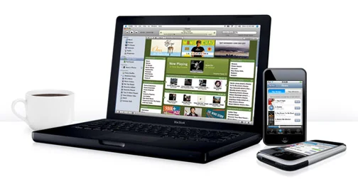
When Apple and Starbucks first announced their iTunes partnership I was intrigued but not particularly excited.  I didn't really understand why I would want to interact with a Starbucks branded version of iTunes, even if they were giving me a free song.  But... I tried this out at a Starbucks on Friday, and I have to say it's pretty amazing.  Amazing enough that I almost forgot my coffee in the iTunes haze.  Why is it so amazing you ask?  Two reasons.  The first is that it was seamless to the point of being magical.  The second is that it was an inspiring example of location based content customization.

So, let's go back to seamless for a minute.  I walk into Starbucks, turn on my iPhone, click on the iTunes music store and voila, a Starbucks button appears at the bottom of my screen. Clicking on it allows me to not only to purchase Starbucks content, but also tells me the name of the song that I hear playing in the store.  I'm not sure why this seems so incredible in this day and age, but it does.

As I mentioned, the second thing that I found really inspiring about this experience was the adaptation of software based on my location.  Again, I'm not so sure why this is so rare these days when so many types of devices can tell where you are, but there are very few companies that are actually using your location to deliver customized content to your phone or computer.  Props to Starbucks for seeing an opportunity and doing something interesting.

Unfortunately this service is currently only available in New York and Seattle, but more Starbucks locations are scheduled to participate soon.

Eric Johnson, meet World

0925-Sixty_Switches_of_Fury.jpg

World, meet Industrial Designer and digital music artist extraordinaire, Eric Johnson.    Eric just debuted  two of his most recent musical experiments at Etsy Labs Handmade Music nights.  The first was  his very entertaining Theremin Crutches.    He recycled an old pair of crutches into a large theremin.  The result looks and sounds like someone releasing all the stress the crutches have collected.  Love it!

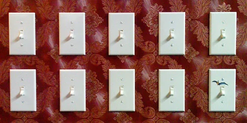
Eric's other project, Sixty Switches of Fury, is even more fabulous.  It's a controller made to look like a piece of suburbia.  The large section of wall houses 60 (now 61) light switches each controlling a music sample.  The switches are arranged in octives like a keyboard, but unlike a keyboard you don't have to hold the keys down.  Instead you just turn the switches on or off, creating a more natural and useful interface for those of us with only 10 fingers.

I appreciate Eric's approach to musical instruments because he comes at it from a design background and not just a musical one.  The end result is all about the user interface and the interactive experience.  The fabulously entertaining music is just a bonus.  Eric's work was recently been featured by Wired and Time Out New York.  May I just say that Nerdsters are awesome!