New Pepsi Logo
/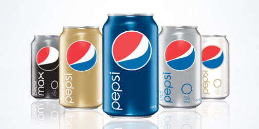
Pepsi updated their logo and product graphics a few months ago. Like any rebranding, there have been mixed reactions. Personally, I really like them. I appreciate that have given some life to the brand by allowing the logo to be slightly organic. The stripe in the Pepsi logo changes size according to the beverage type. Diet Pepsi gets a skinny stripe and Pepsi Max gets a seriously fat stripe. I am pretty sure that this goes against all traditional branding rules, but I like it. It actually gives the brand a little more personality. I hope the trend catches on. (Thanks Brett).