Wikirank

One of the most interesting things about sites that aggregate data is what they can say about trends over time.  The more popular the site, the more interesting its trend data.  Wikirank is a site that tracks activity on Wikipedia pages over time.  Graphing the results to show changes in page popularity.  Out of the ordinary spikes generally reflect a news worthy event.  The site also allows for a number of pages to be compared for more long term data.  The image above shows the popularity of each of the Beatles' members.  Clearly John is the most interesting (to Wikipedia readers).

Color of the Internet

Antrepo4.com tried to answer the (hardly age old) question of what is the color of the internet?  Although this problem could be approached in many ways, they chose to look at it from the scaled perspective of the top ranked sites.  They created 4 posters showing the colors for the top sites in the categories of Global, Design, Games and Blogs.  Then surfacing the most dominant color in any category.  No surprise that the Global website color was blue (safe, predictable and unoffensive - yawn). Visit their website to see the full range of colors and order one of the beautiful color posters.  I'd love to see this done over time.

Graze

Graze is a healthy alternative to your work place vending machine.  It is a natural food company that delivers healthy snacks to your desk via the mail.  They have a delicious looking selection of fresh fruits, dried fruits, nuts, seeds and olives.  My mouth is watering.

The service is subscription based.  They send you boxes once or twice a week until you tell them not to.  You can customize how often you receive the boxes and what types of food you prefer. The type of mix can even be centered around your personal goals or activities, such as loosing weight, maintaining blood sugar, or boosting your immunity. Graze has also taken measures to stay green by using biodegradable packaging and standard mail service instead of custom deliveries.  Each Graze box cost just £2.99 (including delivery).  Unfortunately the service is currently only available in the UK.

Sentenc.es

I am one of those people that doesn't read emails that are longer than 2 paragraphs.  I'm sorry, but I don't.  I just don't have the time or the patience to read 5 page emails.  I'm sure that sounds immature, conceited and worthy of a good eye roll, head shake combination.  But I would be way more productive if everyone stuck to a two paragraph email rule.

That is why I like the thought behind three.sentenc.es, which applies a disciplined approach writing short emails.  Comes in two, four and five sentence variations as well.

Slagsmalsklubben

Back to the topic of digital storytelling (a growing obsession of mine).  Swedish design student, Tomas Nilssons has created this smile worthy digital interpretation of Little Red Riding Hood, as part of a school project.  The animation was inspired by the Royksopp Remind Me video, and borrows heavily on the style and format.  Despite the me-too aspect, I greatly enjoyed the twist on the Little Red Riding Hood story.  Another great example of a classic story reinterpreted to a digital story.

Neon Sign Boneyard

In a recent trip through Flickr-land,  I came across this photo set from Flickr user arZan.  The photos are of a Neon Sign Boneyard in Las Vegas, where old signs go to retire.  The signs are piled on the ground in colorful and playful combination.  Creating a kind of niche Vegas history museum.

This looks like such an inspiring little adventure, and a fun place to take photos.

We Tell Stories

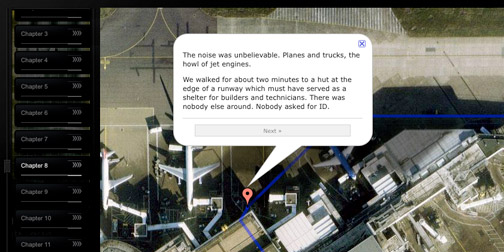
We Tell Stories is a website created by Six to Start for Penguin books. It features 6 writers, telling 6 stories, in 6 weeks. The project takes classic Penguin titles and retells the stories in a digital format - but not your typical, eBook style digital format.  Six to Start consider themselves modern storytellers who tell stories using high tech interactive methods and media.  Of the 6 stories, one is told using areal view map fly overs, one is told using twitter, two are web based choose your own adventure stories, another was written in real time with real time readers, and yet another was interpreted by Nicholas Felton's data driven infographic style.

Whew.  And I'm sure there is much more to come.  The world of digital and location based storytelling is just beginning.  (Found through Half Deserted Streets).

iSketches

Jorge Colombo creates paintings... on his iPhone.  He uses a application called Brushes, which allows him to paint with his finger.  He captures scenes of New York City on his little 3.5 inch digital canvas.  The backlit screen allows for easy nighttime painting sessions.

If you want to see how it's done, Jorge's website features movies of the paintings in progress (a feature of Brushes).  I'm amazed and inspired.

Neave Vote

I can't get enough of Neave Vote.  It is a tongue in cheek voting website intended to make you question the legitimacy of voting.  The questions themselves are pretty humorous, but it is the answers that are the true entertainment.  There is often just no good answer.  You are forced to choose an answer that you probably wouldn't have said, had the question been open ended.

Paracord Survival Bracelet

When does 18 feet of military grade paracord not come in handy?  I mean, come on.  If you agree, maybe you should invest in one of these Survival Bracelets.  The bracelet is made of knotted cord that can be unwound in the case of emergency.  If you purchase the bracelet Survival Straps they are willing to retie the bracelet after use, as long as you send it back with a (true) story about how you used it.

If you are not interested in the story factor (which I think is the main selling point) you can always make your own Paracord Bracelet with these how-to instructions from Instructables.com.

Bicycle Built for Two Thousand

Bicycle Built for 2000 is the latest project by Aaron Koblin and Daniel Massey.  They took the song Daisy Bell (a.k.a.  Bicycle Built for Two) and synthesized it, breaking the song down note by note.  They then paid Amazon's Mechanical Turk workers to listen to a note of the song and reproduce it to the best of their abilities.  None of the workers knew about the greater goal, they were only informed of their task.  All the sampled notes were put back together into a complete song featuring over 2000 human voices.  Amazing!

The Cult of Done Manifesto

Bre Pettis and Kio Stark have published a Cult of Done Manifesto to help creatives banish procrastination and just get on with making.  It is a kick in the butt, get on with it, style of inspiration.  And who doesn't need that?

The manifesto has 13 declarations.  Here are some of my favorites:

Accept that everything is a draft. It helps to get it done.

The point of being done is not to finish but to get other things done.

Pretending you know what you're doing is almost the same as knowing what you are doing, so just accept that you know what you're doing even if you don't and do it.

Illustration by James Provost

.