Return to Sender Postcard

0614-Return_to_Sender.jpg

I like the thinking behind this Return to Sender postcard.  The postcard has a address and message area on both sides.  The intention is that the original recipient can use the same postcard to write back on.  In some ways it goes against one of the main reasons to send a postcard, to send someone an image.  What I like about this is that it captures the idea that letters are meant to be responded to.    It has an element of polite expectation to it, like the RSVP card in a wedding invitation.  Available at Atypyk. (Found on Better Living Through Design)

Black and Decker Simple Start

0611-BandD-Simple_Start.jpg

I saw the commercial for this Black and Decker Simple Start Vehicle Battery Booster the other day.  My first thought was, "What a total chick gadget" followed shortly by "... but damn, what a good idea".  If you haven't seen the commercial, the product is a battery charger that will boost your car's battery through the inside DC outlet (cigarette lighter).  That's right, no jumper cables, no second car, you don't even have to get out of the driver's seat!  It fits into your glove compartment (assuming you get rid of all junk you currently keep in there) and it can be used as a flashlight or to charge your cell phone in case of emergency.  Sigh, I can already hear my future children mocking me.. you used to do what under the hood?

Playaway

0607-Playaway.jpg

I love to listen to audiobooks while I travel but I'm not always organized enough to put them onto my iPod before I leave.  These little Playaways are audiobooks housed in their own little players.  One (replaceable) AAA battery gets you through a 12 hour book.  The players come with their own set of headphones that plug into a standard jack (in case you want to use speakers, or your own headphones).  Playaway doesn't consider its players disposable; they encourage users to pass them along, just like a good book. Each book costs around $35 (prices vary depending on the book).

iPhone

0606-iPhone.jpg

I saw the new iPhone commercials today and my excitement has been renewed.  I've gone through a few phases in my opinion of the iPhone (thus far).  When I first saw it I wasn't that impressed.  Yeah it's a nice design.  Minimal buttons and a big touchscreen, but so what?  Lots of other companies can/are doing that.  Then I watched Job's keynote introducing the phone and I was totally hooked (you had me as scrolling).  But that was a while ago.  In the past few months every iPhone wannabe that has been released has made me less and less excited about the iPhone.  These commercials today reminded me about what made me so giddy watching the initial keynote.  That thing that Apple does so well; combining useful functionality with innovative user interfaces and housing it a sleek outer package.  It's about putting equal importance on hardware and software (and packaging for that matter), bringing them together to complement each other, trying to perfect every aspect of the experience.

Hasan Elahi

0605-hasan_elahi.jpg

Part art project and part alibi, Hasan Elaihi's self tracking project is totally fascinating.  After finding out that his name had been mistakenly added to the FBI's terrorist watch list, Hasan Elahi decided to be totally open about his life.  So he  turned his life into the ultimate blog.  His site, TrackingTransience.net, shows thousands of pictures of his daily activities (including meals he's eaten, toilets he's used, airplanes he's been on) accompanied by a list of debit card transactions and his current location (care of a GPS unit he carries in his pocket).  He's been doing this daily since 2002.  His theory is that "the best way to protect your privacy is to give it away".  He figures the government monitors all of these things anyway but without much accuracy.  Why not help them get it right by simply providing the information yourself.  Awesome!  (Found in Wired Magazine)

Reactee

0604-Reactee.jpg

Want to send a message?  Why not do it with your own custom t-shirt complete with text response number?  Just go to Reactee.com and choose your slogan and keyword.  When spectators  text your keyword to the number shown they will receive a text message of your specification.  You can change your customized message as often as you want.  Options are available to notify your cell phone whenever your shirt elicits a text, or allow for texters to send you a message back.  And all this fun for only $20-27! (Found through NOTCOT)

Stuck in Customs

0601-stuck_in_customs-2.jpg

Check out this gorgeous Best Of collection from photographer Trey Ratcliff, (a.k.a. Stuck in Customs).  He uses High Dynamic Range (HDR) photography to create images that border on illustrations.  According to Trey, "a well-executed HDR image is evocative of the actual scene itself. When a human eye is actually on location, it is constantly moving, adjusting the pupil size, allowing in more light in some areas, less in others, and the visual cortex actually works to build a patch-like vision of the scene".  For more info about HDR go to Trey's blog.

Photosynth

0531-Photosynth.jpg

OoooOOo... I've just been playing with this demo of Photosynth.  It's fun and amazing on so many different levels.  The demo is a 3D reconstruction of St Mark's Square in Venice, made up of photos taken from Flikr.  The photos are arranged based on their spacial relationships, creating a virtual model that can be rotated and zoomed.  Graphics indicate where the picture was taken from and outline of other near by photos.  This demo was released almost a year ago by Microsoft Live Labs and featured at this year's TED conference. 

What is really amazing to me is how such large amounts of data can be so easily manipulated (accomplished partially by just focusing only on what is within the parameters of your screen).  For more about the technology and it's uses check out this video. (Thanks Mike!)

Street View

0530-Street_View.jpg

Wow...Street View on Google Maps is really amazing.  It is street level photos that you can rotate 360 degrees and zoom in and out to show what you would see if you were standing on that point in the map.  So far it only exists for New York City, Denver, Miami, Las Vegas and San Francisco but hopefully this is just the beginning.  This is one of the Google Map features that I've been waiting for, (although it wasn't quite as awesome in my head... it was more about photo reference shots for directions).  If you haven't tried it out yet, go do it right now at maps.google.com and click on Street View.

Botanist

0522-botanist_bench.jpg

This gorgeous series of tables and benches, called Botanist, was designed by Brandon Lynne and Dario Antonioni.  They are made out of cut and bent aluminum covered in a glossy high impact powder coat or a natural wood veneer.  Their simple shape, combined with the use of materials allows these benches fit nicely into any environment, indoor or out.

Arc

0521-Digg-Arc.jpg

Check out this new visualization tool by Digg Labs called Arc.  It shows popular stories in arcs based on themes.  It's not quite as effective at seeing the overall picture as Swarm or Stack are (see previous post) but it's very pretty to look at and I like that they keep exploring new ways to visualize ever changing and expanding data.

Cycloc

0522-Cycloc.jpg

I've seen this Cycloc bike rack a few times now, originally at an RCA grad show and most recently at ICFF.  It is such a simple and elegant solution.  Your bike basically twists into it, using the unbalanced weight to keep itself in place.  The inside of the Cycloc provides storage for your bike gloves or other accessories and holes in the top and bottom allow a bike lock to be added to the mix.  It comes in 4 colors to match your interior including a black option which is made out of recycled plastic.  Designed by Andrew Lang.  Brilliant!

The Trafalgar Great Chair Grab

0522-tom_dixon-trafalgar_chairs.jpg

I attended a talk by Tom Dixon earlier this week at HauteGREEN 2007.  Part of his talk was about this project, the Trafalgar Great Chair Grab. The thinking behind the project is that a lot of designer objects are very expensive and not affordable to many people.  Tom Dixon was attempting to give design away for free by filling Trafalgar Square in London with chairs he designed and then just inviting people to take the chairs home with them. 

This is an interesting idea in itself but what caught my attention was the second half of the scheme.  In order to fund the project he took one of the chairs and left it in a copper bath in an effort to make one 'precious' or valuable version of the chair to sell.  The idea being that one precious object would pay for the others.

100 Mondays

0521-100_Mondays.jpg

Plataforma Humana is trying to collect "100 days in 100 images of 100 people, or better yet of 100 people around the world taking 100 pictures of their Mondays".  Basically on any old Monday you take 100 pictures (about one every ten minutes) of whatever you are doing (eating, staring at the computer, dancing).  The idea is to take the photos from your own viewing perspective so that the final effect is to live 100 Mondays from different people's points of view.  They are not publishing the results until they have received all 100 Monday's worth or photos (currently at 22).  I'm adding this to my To Do list!

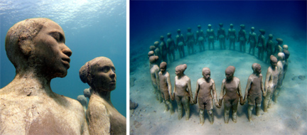
Underwater Sculpture

0518-underwater_gallery.jpg

This is one of the pieces from the Grenada Underwater Sculpture Gallery in the West Indies.  The gallery was stared by artist Jason Taylor in May 2006.  The underwater gallery has a couple purposes; one is to attract tourists to Grenada, another is to act as an artificial coral reef, and the last is to create a unique way of looking at art by utilizing the effects of water, light, and sea life to distort or highlight aspects of the sculptures.  All of the underwater art celebrates Caribbean culture and people.  The sculputres are located about 5 meters underwater; viewable by snorkelers or divers. (Found through Wooster Collective)