Greg Washington Portfolio Site

I was reminded of Greg Washington's portfolio site today.  I first saw it about 4 years ago, and to this day it remains one of my favorite portfolio examples.  The main background for the site was Greg's hands and face squished up as if on a scanner.  His breathing was reflected in the glass.  The whole effect was just so unique and brave that I remember thinking - if I received this portfolio I would hire him immediately.  Unfortunately the original site is no longer up but you can see some images and video of the website on Greg's Behance page.

If someone has a more interesting portfolio example, please send it in.  I'm always looking to be impressed by portfolio sites.

Photosynth Released

I've been a huge fan of Photosynth since I first saw the TED talk about it last year.  Photosynth was just recently released to the public for your enjoyment.  If you are not aware of Photosynth, it is an awe inspiring piece of software from Microsoft Labs that stitches photos together to create explorable 3D objects.  My favorite part of this release is that users can create their own synths.  I'll let you know when I add mine.  In the meantime, make sure to explore some of the more popular examples (National Geographic did some great ones).  Unfortunately Photosynth is not yet available for the Mac.

Everymoment Now

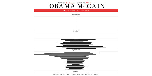
Everymoment Now is an info-graphic comparing mentions of American presidential nominees Obama and McCain in the news.  It provides an interesting glanceable history of the election talk over the past few months.  Drilling down to either nominee shows a more detailed view of the references.  Check back in on Everymoment Now after the election to see their next project. (Found through the always fabulous Swissmiss).

Look Up

0915-lookingup.jpg

Alex Ostrowski's Look Up business cards are atypical.  Sure, they are standard business card size and contain his email address... but that is where the traditional aspects stop.  The rest of his card is devoted to making people happy - and why not?  The front of the card depicts some chimneys and the back of the card contains text about looking at chimneys when you are feeling down (complete with some explanation about why you should take such crazy/good advice).

Heklucht Bikestand + Pump

0915-bikestand.jpg

The Heklucht Bikestand is a place to lock up your bike combined with a bike pump to add air to your tires.  The idea came out of a neighborhood revitalization project in Ypenburg, The Netherlands.  The project's aim was to bring neighbors together in an interactive way.  The bike stand itself has a nice utilitarian functionality to it.  Putting the bike stand in front of houses creates an interesting but unnecessary element to the design story.

Migration

I'm a big fan of Hellovon's artwork.  I actually just bought a print a few months ago.  Gorgeous sketches.

Hellovon has a new project entitled Migration.  It is a two part project, picturing birds migrating from London to New York.  The birds are shown on two large billboards.  One is currently up in London's Brick Lane.  The second will be posted in Williamsburg, Brooklyn in the coming weeks.

Wannado City

0905-wannadocity.jpg

Wannado City makes me want to be a kid again.  It's a reality based theme park for children where they can roll play grown up jobs in an mini city.  Children can operate on a patient, cook up a pizza or even solve a crime.  There are over 200 jobs for kids to try from Club DJ to Anesthetist.  Wannado City is located in Sawgrass Mills Mall in Fort Lauderdale, Florida.  Who needs Disney when there is real fun to be had!

ihologram

0902-walkingcat.jpg

I can't stop watching this video.  It is a fantastic animation of a walking cat, made to look like a hologram.  The animation was made by David OReilly.  Its 3D effect is created using anamorphosis warping and an assumed viewing angle.  The effect really pops with the addition of turning the device.  As the phone is turned, the gyroscope senses the movement and adjusts the animation appropriately to change the cat's direction.  Amazing!

Touch Sight

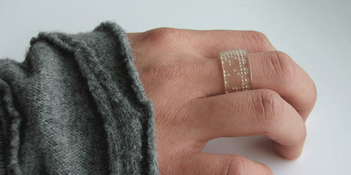
Touch Sight is the first camera designed specifically for the visually impaired.  It is a concept created by Chueh Lee and the Samsung China team.  The camera is held against the photographer's head for stability.  It records the image along with 3 seconds of audio to be used as a title.  The image is then displayed on a flexible braille surface for the photographer to touch.  Inspiring idea.

1% Water

0820-onepercentwater.jpg

As part of their 1% Water exhibit, curators Ilse Crawford and Jane Withers have started a Water Archive.  The archive is a collection of water samples sent in by people around the world to map the 1% of the Earth's water that can be used for human consumption.  They ask people to bring or send in 50 cl of water along with an explanation and/or picture of the source.  The water samples they are looking for are any fresh water such as; water from rivers, lakes, groundwater, rainwater, spring water, mineral/bottled water, religious water (ganges, lourdes), dangerous water (virus, toxic, bacteria, chemicals), polluted water (from industry or human use), water from special places/cities/ landmarks (water used to flush the toilet in the Eiffel tower or water from a special fountain), water which is stored in special places (3 year old water from a water bed, heating systems, fridge), tapwater (but only when it’s special).