Quick Order

0114-quickorder.jpg

I stumbled across this Starbucks Quick Order application for the iPhone or iPod Touch.  I believe the application is just a concept, but I hope it becomes a reality.  Quick Order allows you to select your desired beverage using your phone, with detailed information such as size, type of milk, and any desired extras.  The application then produces a 2D barcode for you to scan yourself in the store to avoid the line.  You can save your favorite drinks for an even faster order process next time.  Quick Order also includes a Quick Pay feature, with a predefined amount of credit, to complete the process.  This application is well though out with great graphics and a nice overall Starbucks feel to it.  This concept was created by multimedia designer Phil Lu.

Cinema Redux

0114-movie.jpg

Cinema Redux explores the idea of viewing an entire movie in one image.  The above picture is a section of images taken from the movie Taxi Driver at one second intervals.  The larger resulting picture shows some interesting poetic editing elements and insight into the overall tone and flow of the movie.  I'd love to see one for a really color intensive movie such as Hero. This project was created by Brandan Dawes using the ever more popular open source programing language, Processing.  (Found through Andre Brocatus was here...)

Big Dipper

0109-big_dipper.jpg

I just finished watching this mesmerizing video of Sarah Van Gameren's recent Big Dipper exhibit at London's Design Museum.  The project is a large machine that creates candle-dipped chandeliers.  Two rows of strung wicks circle each other, periodically being dipped into wax.  The process takes 12 hours to create 24 finished chandeliers.  It's really beautiful to watch.  (Found through Hip.Young.Thing).

Mark lives in IKEA

0109-marklivesinikea.jpg

Comedian and filmmaker, Mark Malkoff, somehow convinced a New York area IKEA to let him live in their store this week while his apartment was being fumigated.  He is filming his experiences and posting them on his website for your viewing pleasure.  I had a nightmare about living in IKEA once, so this idea totally fascinates me.  As Mark says, 80% of his house is IKEA anyway so what's the difference.  Mark will be living at Paramus New Jersey IKEA until Saturday if you are inspired to go visit him.  (Found on the ).http://www.blogger.com/img/gl.link.gif

ClothTAG

0108-RFID_cloth_tag.jpg

Laundry instruction icons seem to be from a time before it was important to make icons easily understandable.  I can never remember what the triangle means vs the circle.  I always have to look them up - and I consider laundry one of my more developed domestic skills.  One solution to this problem would be to just make better icons.  Or... go the high tech route, like designer Samgmin Bae, and break out the RFIDs.  Samgmin's ClothTAG concept uses the idea that laundry labels could have an RFID element that would be readable by washing machines and driers.  Young domestic goddesses like myself (ha!) wouldn't have to know anything about laundry, the machines would be able to make appropriate adjustments.  This isn't a completely new idea, but it's a more well executed concept then some of the others I've seen.  (Found through Yanko Design).

MOO

0108-moo_minicards.jpg

MOO is a modern approach to a printing company that focuses on making virtual content into something interesting and tangible.  They have a range of great products, all that are printed using your images or artwork from online sites such as Flickr, Bebo, Facebook, and more.  I really like their MiniCards.  You get 100 70mm x 28mm cards, each with an image on one side and a personalized message on the other side for $19.99.  They also make greeting cards, sticker books and postcards.  The best part is that each print can have a different image on it, so you get 100 unique MiniCards, 20 unique postcards, etc.  I'm definitely going to order some.  Oh, and they have global shipping so don't write this off as a US only experience.

Naming Names

0105-naming_names2.jpg

Naming Names is an awesome interactive visualization created by Jonathan Corum and Farhana Hossain of The New York Times.  The graphic examines how long the presidential candidates spoke at each debate leading up to the Iowa caucuses and who mentioned the other candidates by name during those debates.  The bands around the outside represent each of the debates in order.  The width of the ban shows the amount of words spoken in that debate.  Scrolling over the politician's names isolates the arrows indicating who mentioned them during the debates.  Clearly Mrs. Clinton was viewed as the biggest threat, as her name has by far the most arrows coming from both parties.  (Found through the GOOD Magazine Blog).

Sony's ODO Twirl N' Take

0105-twirl_and_take.jpg

Earlier this year, Sony introduced a line of green concept gadgets, called ODO, which get their power from alternative sources such as solar panels and mechanical cranks.  The newest addition to the ODO line is this Twirl N' Take digital camera.  Fifteen seconds or rolling provides enough juice for one photo. I like that they chose to go with rolling over a hand crank.  It seems much less tedious.  The rolling approach also lead to an interesting form which also creates a natural view finder and handle.  Very cool concept.  (Found through Apartment Therapy Re-Nest).

Positive

1229-negative_refuse.jpg

Positive is a conceptual project created by Stephen Woowat, a British graphic designer.  The concept is a Negativity Refuse Bag to throw out physical items that have emotional baggage attached to them.  The bags encourage you to "Throw away that photo of the ex, or that poor performance report and forget about it".  This is a smart, well executed, idea with a lot of thinking behind it.  My favorite part of the bag is the instructions for use which include: Dispose of bag in nearest trash receptacle; Close eyes; Take a deep breath; Think positive thoughts.

Robotlab's Bios [Bible]

0101-bible_robot2.jpg

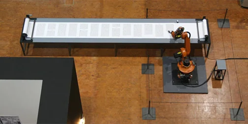
Robotlab is a future thinking group of Germans who create social interaction experiments between people and robots in public spaces.  One of their more recent projects is entitled Bios [Bible].  It is a museum exhibit where an industrial robot is writing out the Bible on scrolls in a calligraphic style as monks have traditionally done.  If the idea of this makes you gasp a little, that's a good thing.  The project is meant to make people question their thoughts on faith and technical progress.

Project 99

1221-project99b.jpg

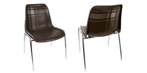
Project 99 is a furniture project by Dutch designers Stefan Louwerse and Richard Broeksema.  They are creating 99 pieces of original furniture based on refurbished chair frames.  The project is made up of number of series, each focusing on a different reupholstering material including second-hand clothing, wallpaper, rubber and cowhide.  The chairs cost (appropriately) 99 Euros each.  (Found through Pan-Dan).

The Sheep Market

1219-sheep.jpg

Fun with Artificial Artificial Intelligence!  The Sheep Market is a bizarre and intriguing collection of 10000 sheep drawings created by workers on Amazon's Mechanical Turk.  Each worker was instructed to "draw a sheep facing left" and paid $0.02 for their troubles.  You can actually watch the sheep being drawn.  My favorite fact about this project is that 662 sheep were rejected - my imagination drools at the idea of what these rejections were based on.  (Found through the Sub-Studio Design Blog).