Synoptic
/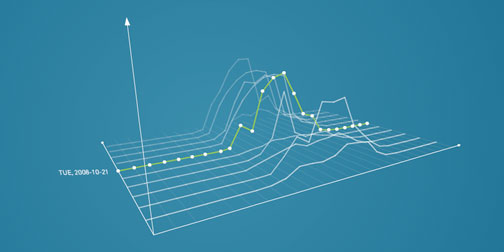
I'm always looking for new inspiration to feed my information visualization addiction. Today I found that inspiration in Synoptic. Synoptic was created by German design student Roland LoBlein. It visualizes meteorological data specified by the viewer, and arranged chronologically. The visualizations are beautiful, but what really got me was the ability to turn the graph around in 3D. It immediately gives the data more life and relevance. OK, I'm going to say it again - Damn, I thought I hated charts. (Found through Computerlove).