Outdoor Cutlery

0528-cutlery.jpg

Anafim is a set of outdoor cutlery designed by d-Vision, an industrial design internship program.  I don't think this cutlery is totally necessary.  I don't see the difference is between carrying around half a fork or a whole fork.  However... I still really like this idea.  Not from a utility point of view, but from an experience point of view.  I would enjoy using this cutlery.  It has a fun natural and artistic feel to it. You could find just the right stick handle for your eating preferences.  It also has the satisfying underlaying reference of making tools out of things in nature but with a modern twist where you don't have to sharpen your own blade.  (Found through MoCo Loco).

Get London Reading

0527-getlondonreading.jpg

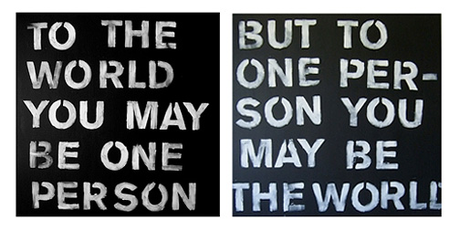
Get London Reading is a campaign to encourage Londoners to make more time for reading.  The campaign includes this great advertising graffiti (featuring book quotes) and a fabulous interactive map showing books set in the different neighborhoods.  This is a nice idea for people living in London as well as visitors to the city.  It encourages reading or allows you to experience the communities where your favorite books took place.  More cities should adopt this idea.

Easy PB&J Jar

0527-ezjar.jpg

Mmmm, I love peanut butter.  Everyone who loves peanut butter knows how much it sucks to get to the bottom of the jar (and not just because you are out of PB).  Even if you are a talented scraper, the bottom of the jar is hard to get to, especially without getting peanut butter all over your hand or knife (or spoon if you are so inclined). Anyway... Sherwood Forlee has solved all of my problems with this Easy PB&J Jar.  It includes the simple but brilliant improvement, both ends open to easily access the bottom of the jar.

Extinction Timeline

0521-extinctiontimeline.jpg

This trending map has taken a slightly backwards but highly effective approach.  Instead of showing when technologies or trends will take off, the Extinction Timeline shows when things will no longer exist in any significant way.  It provides a really great perspective of the future.  I'm not looking forward to the 2025 years when we will lose work-free weekends, blogging and most upsetting, the Maldives (note to self: book trip soon).  (Found through Swissmiss).

Little Zoo

0520-littlezoo.jpg

I get great joy out of seeing little things photographed as if they were big.  I'm not sure why.  I think I like the thought that had to go in.  Do you just carry miniatures around in your pockets in case you come across just the right setting for their next adventure?  Or do you plan out your subject's story in advance, carefully constructing their adventures over time?  My latest little obsession is with Elisa Dudnikova's Little Zoo.  The photographic series tracks a deer, a sheep, a giraffe and some polar bears on their trek through the big world.

F**k Grapefruit

0519-tastyfruit.jpg

I Ffffound this chart today created by xkcd.  I've been having chart and graph woes this week (if you are a long time reader this will not be a shock to you), so I found this chart particularity enjoyable.  It graphs fruits based on their ease of consumption vs their tastiness.  I'm not sure I agree with all the fruit placement.  Peaches are not that easy to eat and tomatos are good!  My favorite part of this image is the title - F**k Grapefruit.

Bombay Sapphire Design Competition - Vote

0516-vapour.jpg

Most designers are probably familiar with the Bombay Sapphire design competition.  It has been going on for many years.  Designers are invited to submit designs for a new martini glass inspired by Bombay Sapphire gin.  The 2008 national entries are currently  posted for voting.  If you are voting from the US, my friend Mike Roller is one of the US designers featured.  His glass, entitled Vapour, has 10 glass elements supporting a classically shaped martini top, represents the 10 ingredients being vaporized into the special drink.  Vote for Mike's Vapour design by entering the website, clicking on Vote for Favorite and then scrolling right to view all the entries.

Create the next Docs

0515-createdocs.jpg

Just when I thought Dr Martins had officially gone out of style for good... here they are again.  Don't get me wrong, I spent a solid 3 years of my life in Docs (steel toes at that) but seriously, they are still around?  Anyway, Docs are trying to make a comeback with this design competition for their user generated FREEDM line.  Anyone is free to submit a design.  You can use the interesting drawing tools provided on their website (including spray paint and a lighter) or you can download a template to bring into your design program or medium of choice.  Two of the entered designs will make it into production.  One will be chosen by the people (...insert forceful upward punch into the air here...), and one will be chosen by a panel of insiders.

Colors of NYC

0514-ColorsOfNYC.jpg

For awhile my life was split between Fort Lauderdale, Florida and New York City.  Going back and forth, I was always struck by the color difference between the two cities, especially in the winter months.  Florida was lush and green with with sunny pastel accents and New York was colorful but in a gritty and raw kind of way.  Julie Cloutier of Facing Desks had captured some of the colors of NYC in this great NY Color swatch book.

Luxury Tax

0514-luxurytax.jpg

I have a great appreciation for smart graffiti, and I'm definitely filing this Chicago sidewalk art under smart graffiti.  Apartment Therapy (the source of this image) speculates that the artwork is a comment on the old homes that are being torn down to build luxury homes.  This is something we saw a lot of in Brooklyn as well.  Regardless of the message, the Monopoly sidewalk reference alone deserves a thumbs up.

Bad Luck

0513-coinmaster.jpg

I saw this sign on the Coin Master in my local grocery store. The machine is located next to the lottery stand.  The sign reads "Please do not scratch your lotto tickets here - it's bad luck!".  Ha!  This is a great example of knowing your audience.

Tom Schmelzer

0507-tomarm.jpg

Normally a diamond of this ridiculous enormity would capture your undivided attention, but it's a little hard to concentrate when the diamond is ATTACHED TO A SEVERED ARM ON A ROTATING BRACKET.  This great sculpture, entitled Engagement Ring Being Followed by a Woman, was created by Tom Schmelzer.  It is meant as a statement about the ridiculous measures of value that society inflicts on itself.  (Found through Pan-Dan).

Pixlporn

0507-pixlporn.jpg

Pixlporn is a risque, or rather not so risque, website that features celebrity's private bits in super pixelated form.  You can look at it as art, as an interesting color study, or an exercise for the imagination.  However you look at it, it's hard to stop looking.  Each pixel image is tagged with the celebrity featured and the source of the image.  The above pixels belong to Madonna (in case you were squinting, I mean, wondering).

All of Inflation's Little Parts

0505-inflation2.jpg

The New York Times Online often impresses me with its great online interactive graphics.  I noticed this one earlier this week.  It is an info graphic to visualize the spending changes that are affecting inflation in the US.  Each shape represents a different category; showing how much the average American spends and how spending in that category has changed over the past year.  I like that they are playing on the idea of a soap bubble for their graphic... very inflation appropriate.