Tylenol Cool Burst

0909-tylenol-coolburst.jpg

I was pleasantly surprised the other day when I took a Tylenol Cold, and instead of being greeted with a horrible, bitter, disgusting, face distorting  taste, my mouth was filled with a burst of mint.  Tylenol calls it 'Cool Burst' and has added this pleasantry to a bunch of their products.  I know there are lots of valid arguments as to why making medicine taste bad is a good thing, but for big babies like me I say, bring on the minty cool burst!

Thiriving Office

0907-thriving_office.jpg

If you work at home it is sometimes hard to get the respect you deserve.  Put a stop to those questions about whether or not you work in your pajamas by using the Thriving Office CD.  It's the soundtrack of an office in full swing. The CD has two tracks, 'Busy' and 'Very Busy'.  Both are 39 minutes long and feature the sounds of phones, voices and computers.  They will never know it's just you and your cat... I mean assistant.

Net Disaster

0905-net_disasters.jpg

I don't know why this is so fun, but it is.  Net Disaster is a website that allows you to inflict catastrophes on your favorite (or least favorite) websites.  Just type in the target site's address and choose the type of damage you want to inflict.  Disasters to choose from include; wasp stings, spilled coffee, throwing tomatoes, sending in protesters, spray paint graffiti and much more.  A great stress reliever.  (Found through the always fabulous Swissmiss).

Braille CD-R

0905-Braille_CD.jpg

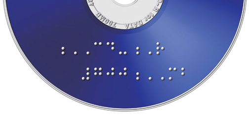
The fact that CDs and DVDs are the same shape and size comes in handy for a lot of reasons, but isn't quite so helpful if you are visually impaired. Mitsubishi Japan has released a line of recordable CDs and DVDs with braille labeling.  Good idea and a great reminder to all designers about the importance of physical differentiators.  I'm not visually impaired, but I'd love to be able to tell the difference between a CD and DVD without reading the fine print.  (Found through Cool Hunting).

My Cuppa

0905-My_Cuppa.jpg

These My Cuppa mugs have been featured on a lot of blogs lately, but they are such a good idea that I had to write about them myself.  Designed by Suck UK, these mugs were created to help you make the perfect cup of tea or coffee.  They have a little color matching guide on the side to help you add just the right amount of milk.  This is perfect if you are into experimenting with milk, and even more perfect if you are trying to instruct someone on how to make your tea/coffee.  'Make it a Builder's Brew would ya luv'.  Available for purchase on the Suck UK website.

Filippa Smedhagen Sund

0905-filippasmedhagensund.jpg

I like the portfolio of Swedish Makeup Artist Filippa Smedhagen Sund.  It contains some gorgeous photography of her work.  What I like most about the site is the interface.  Upon entering the site you get quick instructions on how to navigate, and then off you go.  The interface is simple enough that you could probably figure it out yourself but I like the courteous idea of just showing people what to do up front.  It makes users much more receptive to new interface styles.  The site was designed by the Berlin based company, Mocoro.

Nike ID

nike_ID.jpg

Nike ID is probably the best thing to happen to running shoes since Velcro.  It is a website that allows you to create and order your own set of custom Nikes.  You choose a shoe style and then you have creative control over all the colors (base, laces, swoosh, sole, etc), plus you can add your own graphic or text to the side, and if you have wonky feet you can even order the left and right shoe in different sizes.  Love it! Ordering my first pair tonight.

Also check out the Puma equivalent - The Puma Mongolian Shoe BBQ

What's Bubbling Up?

0810-bubbling_up.jpg

I've been playing around today with What's Bubbling Up.  It's a promotional site for Unicel, created by the brilliant minds at Kelliher Samets Volk.  The site focuses on the idea of making connections by allowing users to create and post messages.  I always enjoy sites based on user content, especially when they invite people to share something they might not normally.  I also really enjoy the thought of unspoken conversations being these lingering speech bubbles - it's a cool visual.  This site reminds me of one of my favorites, the Hope Garden.  (Thanks Jackie!)

Color Changing Lid

0808-color-lids.jpg

This color changing lid, created by Smart Lid Systems, changes color when hot.  Intended for use with coffee, tea or other warm beverages, this lid works as a visual warning indicator that the cup contains hot liquids.  Although I'd like to see even more color change in this product (the original state still seems very red), this is much more effective than just typing 'Caution: May contain hot liquids' on the lid.  This is a good warning indicator because your brain can process the message without much thought, effort or attention.  Watch this video to see the color transformation in progress.  Found through (COLOURlovers)

Splinter Chair

0806-splinter.jpg

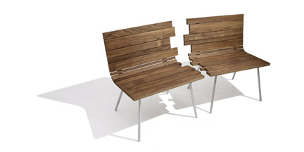
>I like this Splinter Chair because it successfully combines two chairs into a bench, or divides a bench into two chairs - depending how you look at it.  The chairs are very interesting pieces on their own, but even when they are separated, you can't help but put them together in your mind.  The Splinter Chair was design by Matthew Kroeker for Jane Hamley Wells.  The concept for the chair was meant to evoke 'the fragility of relationships, the constant flux between breaking apart and coming together'.