The Anatomy of Cool

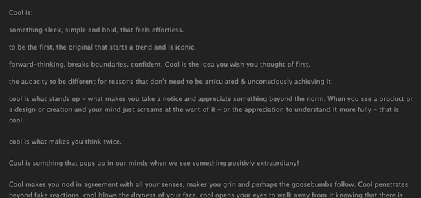
I found this write up on The Anatomy of Cool over on The Cool Hunter.  It made me happy for a number of reasons.  First off, it make me start thinking about how thankful I am that "cool" is still an acceptable word and didn't go out with the 90's, because I can't think of a suitable replacement.  Secondly, it reminded me that cool is more than a descriptive word, it is a state.  A state that is temporary, hard to achieve, and worth striving for.  Read the whole thing for yourself.  I dare you not to be inspired to do something cooler.
Lumadessa

I'm enamored by the work of Portland Maine artist, Josh Brill.  He creates modern illustrations of birds and animals in an ongoing series he calls the Flora Fauna Collection which captures,

"The design identities of plants and animals from around the world. Examining the visual character differences and similarities of species. A field guide of discovery, beginning with birds."

Josh's website Lumadessa features a number of prints for sale ($10-$30) along with free smartphone wallpaper (my phone is currently sporting the colourful Western Tanager (above middle)).

City Eyes

City-Eyes uses Amsterdam windows to experiment with the social boundaries of public vs private space.  A windows is normally a private view on to a public space, but what if the directionality was switched and the private view into people's homes was featured.  The City-Eyes exploration has looked at 5 different windows so far; a window with curtains on the outside, a shop window that darkened during the day and lit up during the night, a window with a dining room table extending to the street, a window with an oval mirror on both sides, and a window set up that projected passers-by into the interior private space.  This exploration was conducted by DUS architects.

Obsessive Consumption Book

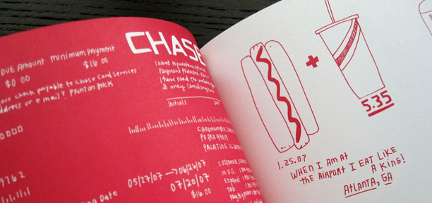
When I got home from work I was happy to find Kate Bingaman-Burt's book Obsessive Consumption on my doorstep.  I opened it to check out a few sketches, but ended up completely enthralled and reading it cover to cover.  The book is based on Kate's blog of the same name, where she keeps sketches of objects that she a has bought.  The purchases documented range from a hairclip for grandma ($5.95) (and one of my favorite purchases in the book) to a faux Eames Lounger ($50.00).  The purchase patterns themselves are very interesting as they span an number of years and life stages (student, marriage, dog, etc) which make you reminisce about your own levels of financial freedoms, or lack there of, over time.  The best part, to me, is the little notes that accompany a lot of the drawings.  A four colour click pen itself is not a very interesting purchase, but when accompanied by the fact that it was purchased to pay bills, it actually becomes very entertaining.  I adored the book, and the journey that it took me on.

TV Posters

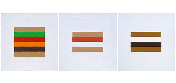
Designer Albert Exergian, created this absolutely stunning series of TV posters as a personal project.  He uses a minimal, modernist style to illustrate iconic TV shows, old and new.  Exergian does an impressive job of capturing the essence of each show in a couple of simple shapes.  The posters are humorous, smart, visual perfection.  Search for your favorite show, I don't think you will be disappointed.  The series is available through Blanka as A1 prints.

Future of Publishing

If you are not one of the 425 000 people who have already watched The Future of Publishing on Youtube, I suggest you check it out.  The video was created by Dorling Kindersley Books.  It is a commentary on the future of publishing.  I like that the video addresses all the preconceptions about youth and their appreciation, or lack there of, of published content, and then it turns what you thought you knew upside down to present a new, novel idea.

The video was produced by Khaki Films, and inspired by The Lost Generation and The Truth.

Pothole Gardens

Graphic design student, Pete Dungey, created Pothole Gardens as part of an ongoing series of public installations trying to bring attention to the problem of surface imperfections on Britain's roads.  He fills the potholes with dirt, and plant flowers in the middle.  Pete illustrates the scope of the poor repair of Britain's roadways by says "If we planted one of those in every hole, it would be like a forest in  the road."

I'm not sure this is the best (or safest) solution to potholes, but I appreciate the sentiment and the idea of using street art (literally in this case) to turn a negative into a positive.

TweetNotebook

I just ordered a TweetNotebook.  It's a personalized notebook featuring one of your own tweets at the bottom of every page.  All you have to do is put in your twitter name and the system (supposedly) picks out your best tweets to line the pages with.

Part of what I like about Twitter is that things you say are momentary, small things go from foreground to background very quickly, very reflective of real life.  The other thing I like about Twitter is that it captures moments in time, on an ongoing basis.  To me, that is what the TweetNotebook is celebrating.  It is kind of like a photo album, reminding you of passing thoughts and captured instants.

The Extraordinaries

It is easy to make excuses about not doing volunteer work, but what excuse do you have not to do a little micro-volunteering?  The Extraordinaries is a group that helps everyday people do good, 35 seconds at a time.  Just go to their website or download their mobile app and get access to all sorts of small activities that will help others.  You can help a child out of extreme poverty by providing some worlds of encouragement, tag some photos for a local museum, or  help build a database of dog shelters.  Lots of the activities can be done right from your computer or phone.  Most take less then a minute.  You can do good on the bus, while waiting for take out, before going to bed, or in an otherwise unproductive meeting.  What is your excuse now?

I couldn't be more excited about this app if I had thought of it myself.

Nutricate

Typically, I consider receipts a waste of time and paper, but Nutricate is looking at some new receipt features that might make me reconsider their worth.  Nutricate receipts come with the nutrition information of the meal you purchased.  The receipts state calorie, fiber, fat and protein information as total amounts and percentages of daily recommended intakes.  These receipts make it easier to track your food intake and make smart eating decisions. To me,  the most ingenious part of this idea is that Nutricate is elevating the value of nutrition to the same level as the value for money, changing the way we think about the price of a meal.

Feltron 2009 Annual Report

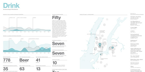
It is one of my favorite times of the year... time for Nicholas Feltron's Annual Report.

Most designers will be well aware of Feltron's tradition, as his reports are an annual source of graphic and information design inspiration.  If you have not heard of them, the Annual Reports are a summary of graphic designer, Nicholas Feltron's year.  They cover the places he has been, the foods he has eaten, the fluctuations in his mood, etc, etc.  They are not only ridiculously pleasant to look at, but amusing to read.  If you are interested in collecting your own annual data, check out one of Feltron's other projects, Daytum.

Fred Lebain

Fred Lebain's photographic series A Springtime in New York features his own photos, inside his own photos. He took a bunch of beautiful, but mundane photos of New York and had them printed on large, glossy posters. He then returned to the setting of each photo and took them again, but this time with the print out of the original photo inside a wider shot. Each photo has its own unique imperfection to hint at the photo within the photo.

I like this concept a lot. There is a stupidly simple brilliance that makes it captivating.