Dissecting Pastry

I always get in trouble for playing with my food.  But my food, rearranging neurosis don't touch on Kathryn Parker Almanas'!  She dissects food, arranges it biology lab style, and photographs it.  The scientific arrangements are a refreshing approach to a typical food still life.  They momentarily change the way I look at food.  This is my kind of innovative thinking.  (Found though PicoCool).

Fifty People One Question

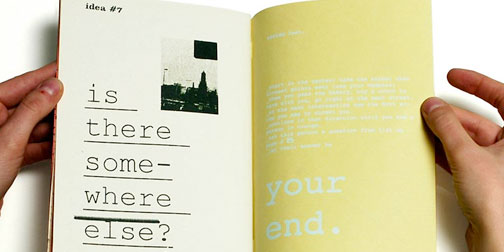
Fifty People One Question is a heartwarming little video project created by Crush + Lovely and Deltree.  I say "little" because it is such a serenely simple idea, and so simply executed, that it seems effortless.  The project does what it says, asks 50 people, in 1 city, 1 question.  The questions are also simple:  What do you wish to happen by the end of the day?  Where would you like to wake up?  ...and the answers are varied and beautiful.  Watch them all here.  (Found through It's That Nice)

GE Smart Grid Website

GE has a beautiful new interactive website to promote their Smart Grid innovations.  The website is stunning, with intelligent interactive features like a print and play augmented reality Smart Grid.  The forward thinking website reflects well on their forward thinking ideas about energy.  GE has some intriguing ideas about integrating alternative power sources and smart meters into consumer's lives.  They make a convincing argument by visualizing the potential impacts.

Lu Cong

I just keep flipping through the Lu Cong's gallery of work in awe.  His paintings are so beautiful and serene.  They are realistic with a twist of oddity.  Kind of like modern versions of Renaissance paintings.

Lu Cong was recently named one of five of “Today’s Masters Making Their Marks”.  I'm guessing that means I can't afford any of his work... eagerly awaiting prints.

Synoptic

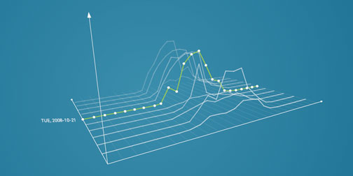
I'm always looking for new inspiration to feed my information visualization addiction.  Today I found that inspiration in Synoptic.  Synoptic was created by German design student Roland LoBlein.  It visualizes meteorological data specified by the viewer, and arranged chronologically.  The visualizations are beautiful, but what really got me was the ability to turn the graph around in 3D. It immediately gives the data more life and relevance. OK, I'm going to say it again - Damn, I thought I hated charts.  (Found through Computerlove).

Time Tagged To Do

0130-timetagged.jpg

Jack Cheng points out that we all spend more time dreading the items on our To Do lists than it would actually take to complete them (guilty as charged).  He decided to increase his own productivity by doing something about this.  His solution - time tagging his To Do list.  For each item To Do he writes down, he adds an estimate of how much time it will take to complete.  That way when he has 20 min free, he uses is to complete a 5, 10 or 15 minute task, instead of avoiding the list all together.

I like the thinking behind this idea.  It is simple, with just the right amount of responsibility and guilt built in.  I'll try this out and let you know how it goes...