Redesigned New York Subway Map
/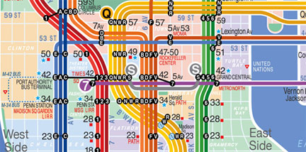
Living in New York I can really appreciate this redesigned NY subway map. It is much cleaner and easier to read than the existing map. Anyone who has been to New York knows that the current subway map is a lot harder to understand than it seems. The color coded lines are easy enough to follow but then you add the lettered trains and good luck to you! Unfortunately this redesigned map is only a concept, developed by Eddie Jabbour of Kick Design, and apparently not being adopted by the NY metropolitan transit authority. Check out comparative images of the old map and the redesigned map here. (Found through Swissmiss)